Moodboards that inspire still-life photographers and streamline pre-production
Need tighter concepts, faster approvals and cost-efficient sets? A well-built moodboard is the still-life photographer's secret weapon. Discover how to create, share and leverage visual references that cut days off your pre-production schedule while elevating final images.
Why a moodboard is the smartest first step on any still-life brief
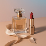
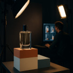
Still-life photography revolves around detail: glass reflections, fabric folds, tabletop shadows. A moodboard crystallises those micro-decisions before a single prop is rented. When clients see colour palettes, lighting sketches and texture swatches side by side, they approve faster—and you waste fewer test shots.
- Visual alignment in one glance. Unlike copy-heavy briefs, curated images bypass subjective wording and show the exact vibe you will capture.
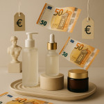
- Budget control. Outlining materials early prevents late-stage prop splurges. Cross-reference ideas with this guide to budget-smart prop sourcing to stay on target.
- Smoother collaboration. Stylists, retouchers and set builders rely on a single source of truth. If the project goes remote, follow the remote art-direction workflow to keep feedback loops short.
Real-world time savings
An internal survey of 58 commercial still-life teams found that shoots starting with a consolidated moodboard moved from concept to sign-off 37 % faster than projects kicked off with text briefs alone. That translates to an average of 1.5 working days reclaimed per campaign.
Six building blocks of a high-impact moodboard
1. One-line narrative
Summarise the story in under 15 words: “Matte pastels meet chrome accents for a retro-futurist breakfast scene.” This single sentence guides every image you pin.
2. Lighting map
Include diagram sketches or reference photos that illustrate direction, softness and colour temperature. If artificial gels are planned, sample their RGB values on the board.
3. Colour palette swatches
Extract HEX codes from reference visuals to ensure prop buyers and retouchers match tones perfectly. Consistent palettes make series images feel intentional rather than accidental.
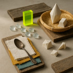
4. Texture close-ups
Zoom on surfaces—grainy concrete, rippled water, brushed metal. Still-life campaigns often fail when texture clashes with product packaging. Show the client those tactile contrasts upfront.
5. Styling props list
Layer short captions under each prop photo: size, material, rental source. When you later consult the moodboard-sharing tools guide, these notes auto-populate purchase orders.
6. Post-production cues
Reference grading styles or composite inspirations. You will help retouchers estimate hours early, avoiding budget surprises. Pair this with AI mock-ups to preview edits in minutes.
Digital versus physical moodboards: which format wins?
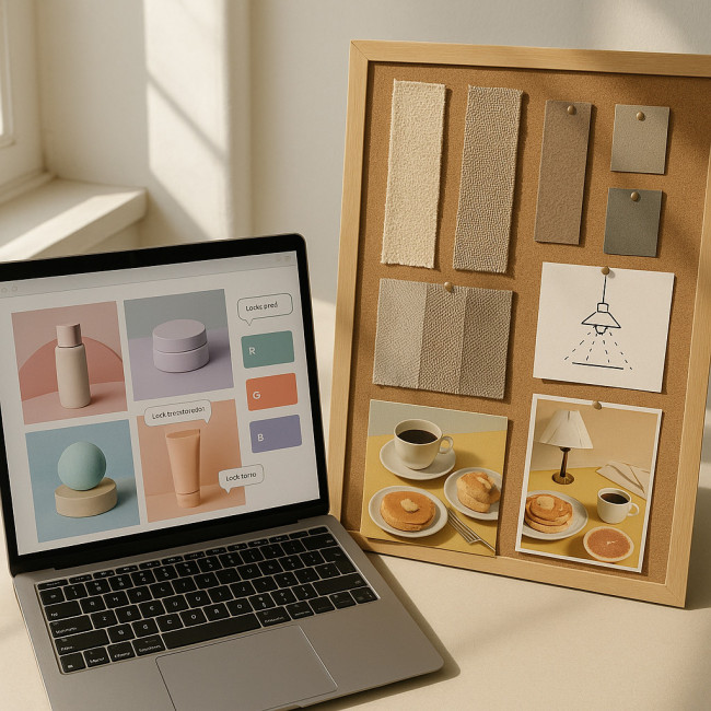
Before we dive into pros and cons, picture a workspace where a 32-inch monitor floats beside a foam-core print. The screen flickers with interactive pins, video loops and RGB readouts, while the board holds fabric strips and metallic paint chips you can touch. That tactile-versus-tech confrontation encapsulates the entire debate: speed against fidelity, remote freedom against on-set reliability. Keep those differences in mind as you scan the comparison chart below.
| Criteria | Digital board | Printed board |
|---|---|---|
| Real-time updates | Instant cloud sync for global teams | Requires re-print; delays approvals |
| Colour fidelity on set | Screen variance may mislead | Physical swatches under shoot lighting |
| Client engagement | Interactive pins, video embeds | Tactile appeal during in-person meetings |
| Eco impact | Low; no paper waste | Higher; print and courier materials |
Most teams opt for a hybrid stack: a living digital board for iterations and a concise printed version for colour matching on set.
Workflow: from inspiration to approved board in 48 hours
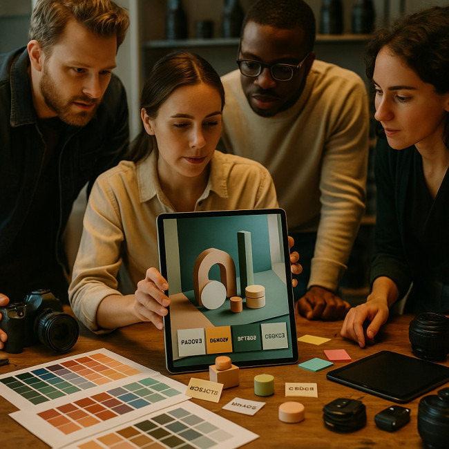
At first glance forty-eight hours may sound impossibly tight, yet the timeline is realistic when every stage feeds the next without friction. The secret is parallel processing: while the photographer curates references, the assistant extracts HEX codes, and the producer drafts the props budget. By the time stakeholders comment, half the revisions are already anticipated. That orchestration only works when your board is clear enough to prevent back-tracking, so treat each step like a relay baton you cannot afford to drop.
- Kick-off call (30 min). Define narrative, deliverables and budget ceiling.
- Collect references (4 h). Pull royalty-cleared images from personal archives, stock sites and the Artfolio still-life photographer directory to benchmark quality.
- Curate & label (2 h). Remove duplicates, add explanatory captions, tag colour codes.
- Share draft (10 min). Use cloud boards with comment threading; set a 24-hour feedback deadline.
- Revise (1 h). Apply client notes, lock creative direction.
- Sign-off (5 min). Client approves; production teams receive the final link and download assets.
Common pitfalls and how to avoid them
- Overcrowding. Limit to 15–20 visuals. More dilutes the message.
- Copyright blind spots. Only pin imagery you are licensed to share internally.
- Ignoring set logistics. If a prop requires special permits (e.g., live flames), flag it on the board.
- Colour inconsistencies. Calibrate your monitor and include Pantone codes for print consistency.
Mini-quiz: test your moodboarding know-how
FAQ
- How much time should I budget for building a still-life moodboard?
- Experienced photographers allocate four to six hours for collection and curation, plus one hour for revisions.
- Which software works best for collaborative moodboards?
- Cloud platforms that support real-time comments—such as Milanote or PureRef synced via cloud storage—are ideal.
- Can I reuse a board for multiple campaigns?
- Yes. Duplicate the board, then replace 30 % of visuals to match new brand colours and product shapes.
- What resolution should reference images be?
- 1 000–1 500 px on the longest side balances detail with fast loading.
- How do I present the board during client calls?
- Share screen, zoom into details, and finish with a one-sentence narrative recap to reinforce focus.
Next steps
Apply these principles on your next shoot and track how many pre-production hours you save. If you need deeper pricing insight, consult the 2025 still-life pricing guide. Effective moodboards not only secure approvals—they win repeat business.
Ready to elevate your portfolio? Revisit your last project, build a concise board, and watch your workflow accelerate.