Online first impression: layout that turns a maquilleur gallery into bookings
Your makeup artistry portfolio has one job online: turn curious browsers into paying clients. The fastest way to reach that goal is to fine-tune your gallery layout. In this guide you will discover proven visual patterns, copy tweaks and UX micro-details that push visitors toward the “Book now” button in seconds.
Why the first three seconds decide your next gig
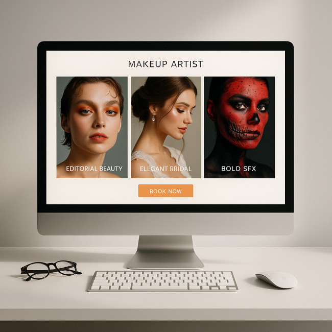
Eye-tracking studies show that visitors form an opinion about a creative portfolio in roughly three seconds. During that micro-window they scan colour harmony, image order and call-to-action clarity. A disjointed gallery triggers doubt; a clean, story-driven layout signals professionalism and justifies premium rates.
The scroll-stopper principle
- Hero trio: Open with three images that capture range: editorial, bridal and creative SFX. The combo proves versatility without overwhelming the eye.
- Consistent lighting: Avoid mixing tungsten backstage shots with daylight beauty images on the first row. Uniform colour temperature feels intentional and trustworthy.
- Smooth ratio: Stick to 4:5 or square crops above the fold. Mixed ratios create visual “noise” and distract from the looks themselves.
Gallery architectures that convert
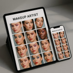
1. Uniform grid with dynamic breakout tiles
A symmetrical grid comforts the viewer; one oversized tile every second row breaks monotony and draws focus to signature work. Pair the enlarged tile with a subtle badge such as “Most booked look”.
2. Masonry grid for high-volume portfolios
If you house over 60 images, a Pinterest-style masonry grid helps compress vertical space. Add category filters (“Bridal”, “Runway”, “Body paint”) at the top to maintain orientation.
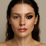
3. Before/After slider blocks
Interactive sliders showcase transformation power better than any caption. Limit usage to one per page to avoid performance drops; anchor it near testimonials for social proof synergy.
Copy and metadata: the silent persuaders

Great visuals spark interest; copy seals the deal. Below every image add a two-line caption featuring skin tone or theme plus one high-intent keyword. For deeper optimisation, follow the SEO-friendly caption framework. With structured alt attributes you lift accessibility scores and climb search rankings simultaneously.
How to write a conversion-driven CTA block
- Promise outcome: “Book flawless camera-ready makeup.”
- Add urgency: “Limited wedding weekends left in 2025.”
- Reduce friction: “Get a quote in two clicks.”
Visual trust signals that close bookings faster
Clients want proof you can handle their brief. Layer multiple trust cues without crowding the page:
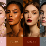
- Diversity badge: Link to your inclusive skin-tone showcases to reassure multinational planners.
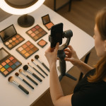
- Behind-the-scenes reels: One 15-second clip reveals hygiene practice and calm set presence—learn to stage it from this reel blueprint.
- Real-time availability widget: Synchronise with your calendar so a client can lock a date during peak enthusiasm.
Speed and mobile flow: non-negotiables in 2025
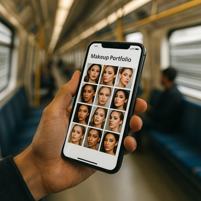
Over 68 % of talent buyers browse portfolios on their phone during commute gaps. Compress JPEGs to under 250 KB without visible loss and lazy-load assets below the fold. A layout that jumps or resizes mid-scroll feels amateur and sends prospects back to broad talent lists on newly listed makeup-artist pages.
Performance checklist
| Task | Target metric | Tool |
|---|---|---|
| Largest Contentful Paint | <2.5 s | PageSpeed Insights |
| Image file weight (hero) | <250 KB | TinyPNG |
| Total blocking time | <150 ms | Lighthouse |
Navigation pathways that feed the booking funnel
An effective gallery acts like a guided tour. Use three navigation layers:
- Sticky mini-menu: Category tabs remain visible on scroll.
- In-line cross-link: After every sixth image, offer a deep dive like curated portfolio sets.
- Footer content hub: Link to contact-focused resources plus social proof articles.
Case study: layout refresh that boosted confirmations by 37 %
Freelance maquilleuse Amira switched from a scrolling carousel to a uniform grid with breakout tiles. She integrated an above-the-fold booking CTA and updated alt tags. Within two months her enquiry-to-confirmation ratio jumped from 11 % to 15 %. The biggest lift came from mobile users, proving how vital static thumbnails are over auto-playing slides.
Putting it all together: your six-step action plan
- Audit current gallery for crop consistency and load speed.
- Select a grid architecture that reflects image count and niche.
- Add keyword-rich captions and descriptive alt text.
- Embed trust elements: testimonials, diversity proof, behind-the-scenes reel.
- Place a clear, benefit-driven CTA above the fold and again after the gallery.
- Schedule quarterly updates—follow the seasonal refresh guide.
FAQ
- How many images should a maquilleur show above the fold?
- Three to five visuals strike the balance between range and load speed without forcing the visitor to scroll for proof.
- Do sliders still work for makeup portfolios?
- Only as single before/after modules. Full-screen carousels often hide key looks and perform poorly on mobile.
- Is video mandatory in 2025?
- Short reels under 20 seconds outperform static posts on social media and increase booking conversions by up to 24 %, so include at least one.
- Which image format is best?
- Optimised JPEG for photos, WebP when your hosting supports it; avoid PNG unless the shot requires transparency.
- How often should I reorganise my gallery?
- Quarterly updates keep returning visitors engaged and improve SEO freshness signals.
Test your knowledge
Take the next step
Apply one layout tweak today and measure results inside your analytics dashboard. When you see enquiry rates climb, compound the gain by adding inclusive showcases or reel content linked throughout this guide. Your gallery will evolve into a booking engine—one pixel at a time.
