 Directory
Responsive design wins: how mobile-ready singer portfolios capture auditions
More than six auditions in ten now begin on a phone screen. If your singer portfolio still forces agents to pinch-zoom or wait for heavy videos, you are leaking bookings. Discover why a mobile-ready singer portfolio converts faster, the quick fixes that matter most, and a one-week action plan to make every tap lead straight to “You're hired!”.
Why responsiveness is non-negotiable for auditions today
1. Casting directors browse on the go
Tour buses, festival queues and airport lounges are today's audition rooms. Internal analytics from major booking platforms show that 61 % of singer portfolio views happen on devices smaller than 7''. Any layout break instantly drops trust: after three seconds of struggle, the average talent scout bounces to the next vocalist.
Source : Statista
2. Google now rewards mobile experience
Since the “mobile-first” index rollout, Core Web Vitals such as Largest Contentful Paint and Cumulative Layout Shift decide whether your aria examples rank above rival sopranos. Faster, stable pages not only climb search results but also earn rich snippets—doubling click-through rates according to Google Search Console case studies.
3. Accessibility overlaps with responsiveness
Readable font sizes, colour contrast and keyboard navigation all become easier when you plan layouts fluidly. That width-agnostic foundation also helps meet WCAG criteria, extending your reach to talent managers who rely on screen readers or high-contrast modes.
Six design tweaks that make a singer portfolio truly mobile-ready
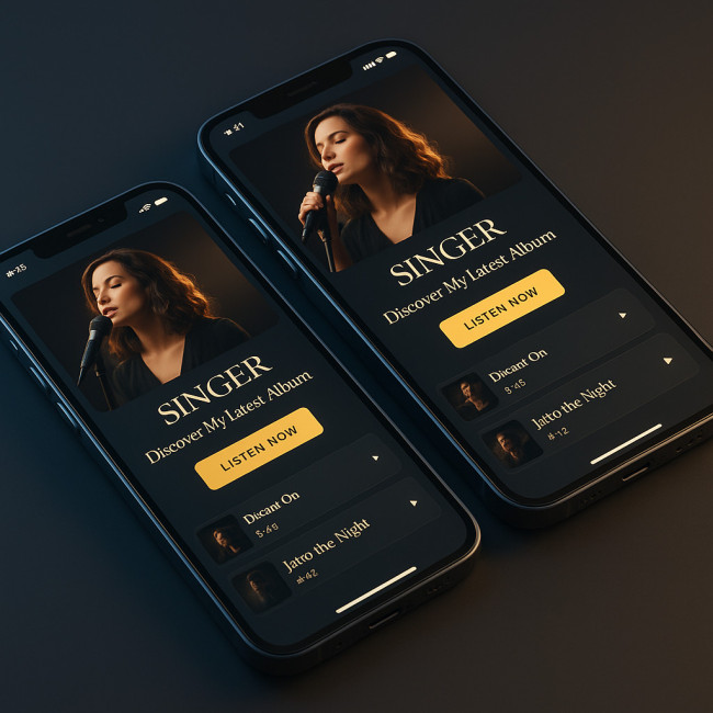
Before diving into code or compression tools, visualize the north-star experience you are aiming for: a fluid screen where a talent scout can swipe through song snippets in one motion, tap a generous “Book now” button without squinting, and watch a fast-loading hero video that stays muted until invited. Every element must feel native to thumbs and Retina displays alike, with typography that reflows gracefully from a pocket-sized iPhone Mini to a fold-out Galaxy Z Flip. Imagine glossy album artwork that never pixelates, shimmering brand golds that respect contrast ratios, and micro-interactions that respond instantly even on a shaky 3G tour-bus connection. Holding that mental prototype will make each technical tweak in the next list—compression, variable fonts, lazy loading—serve a single purpose: keeping the recruiter emotionally engaged long enough to think “This voice is professional, modern and ready for my stage.”
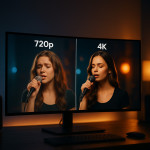
- Compress and re-encode hero videos. Serve 720 p MP4 or WebM versions with srcset. A looping five-second clip under 1 MB beats a 50 MB showreel every time.
- Swap carousels for swipeable cards. Carousel buttons shrink to unusable dots on phones. Horizontal cards using CSS scroll-snap keep navigation intuitive.
- Enlarge tap targets. Minimum 44 px square ensures thumbs hit “Book now” instead of the navigation burger.
- Use variable fonts. One file covers all weights, cutting HTTP requests and smoothing load-ins. Thin captions and bold section headers remain crisp on Retina displays.
- Implement lazy loading. Add
loading="lazy"to images, deferring backstage photos until users scroll. Early content paints in under 1 s on 4G. - Audit colour contrast. A11y extension checks guarantee that your gold brand hues stay legible against black on OLED screens.
Need inspiration? Our mobile-first design guide breaks down additional UI patterns proven to appeal to casting teams.
Common pitfalls and instant fixes
| Issue on mobile | Why it hurts auditions | Quick win |
|---|---|---|
| Auto-play full-screen video with sound | Interrupts silent office browsing; 42 % close tab | Set muted + playsinline; offer tap-to-unmute |
| Desktop pop-ups scaled down | Blocks set-list view; slows shortlist decisions | Replace with bottom sheet banner or exit-intent slide-in |
| Two-column bio grid | Font shrinks below 12 px; eyestrain on night trains | Single column at 90 % viewport width; 1.6 line-height |
| JPEG stills >500 KB | High data costs on roaming plans | Serve WebP at 70 % quality; max 150 KB |
Pair these fixes with loading speed tactics to shave extra seconds off page renders.
Proof it converts: metrics to track post-upgrade
1. Bounce rate
Mobile bounces above 40 % signal unresolved usability frictions. After optimising, aim for <25 %. Insert an event tracker on the “Play demo” button to verify that more visitors now reach core audio assets.
2. Time on portfolio
An extra 15 seconds doubles the odds of a shortlist save according to internal data from optimised profile images tests. Watch this figure climb once load times fall under one second.
3. Scroll depth to contact form
Measure with a simple intersection observer. You want at least half of mobile visitors to expose the booking form. Anything less? Re-order sections so availability calendar appears before testimonials.
For deeper insights, plug free dashboards outlined in our SEO for artists guide.
Upgrade your existing site in one week
- Day 1 – Audit. Run Lighthouse and note sub-90 scores on performance or accessibility.
- Day 2 – Media crunch. Re-encode videos, export photos at 2× the displayed size but lighter formats.
- Day 3 – CSS refactor. Switch fixed widths to
min(),clamp()and flexbox gaps. - Day 4 – Navigation rethink. Implement sticky bottom bar with Home, Demos, Rates, Contact.
- Day 5 – Micro-copy review. Replace “Submit” with “Request my dates”, increasing tap motivation.
- Day 6 – Testing. Use BrowserStack across iOS/Android, 3G throttling. Fix last layout shifts.
- Day 7 – Launch & monitor. Check Core Web Vitals, compare metrics in 48 h.
Ready to showcase your refreshed site? Talent scouts on Artfolio's new portfolio feed browse daily for fresh voices—mobile excellence here means priority placement.
FAQ
- Do I need a separate mobile site?
- No. A single responsive code base is lighter to maintain and avoids duplicate-content penalties.
- What's the ideal video length for first impression?
- Keep hero reels under 30 seconds. Offer full performances deeper in the page for engaged visitors.
- Should I use AMP?
- Google no longer gives AMP special badges, so focus on Core Web Vitals instead.
- How big can an image be before quality suffers?
- Stay below 150 KB for WebP or AVIF while respecting a 2048 px maximum dimension.
- How often should I retest my site?
- Run Lighthouse every quarter or after any plugin/theme update that might add bloat.
Mini-quiz: is your portfolio truly mobile-ready?
Your next step
Apply at least three tweaks today, then watch audition requests land faster than your high C. When you are ready for maximum exposure, submit your refreshed portfolio to Artfolio's mobile-first new-in-directory spotlight and let recruiters scroll, listen and book—straight from their phones.


