Visitor flow analytics: link data-driven layouts to sustainable exhibition ROI
Harnessing visitor flow analytics turns guess-work into measurable value. Discover how to read footfall data, iterate floor plans, and translate every extra minute of dwell time into long-term revenue for your next exhibition.
From raw footfall to strategic insight
Visitor flow analytics track how audiences navigate your space: entrances used, paths taken, dwell times, and exit points. When you overlay these metrics with ticket sales, shop conversions, and feedback scores, you gain a 360° view of what truly generates Return on Investment (ROI).
Key metrics you can't ignore
- Entry heatmap: pinpoints queue bottlenecks and reveals underserved wings.
- Dwell time per zone: correlates directly with learning depth and likelihood to purchase.
- Loop completion rate: percentage of visitors reaching the final gallery or gift shop.
- Repeat path ratio: high values suggest confusing signage or repetitive content.
Low-impact sensors, high-impact data
Infrared people counters, anonymous Wi-Fi pings, and ceiling-mounted LiDAR offer privacy-friendly ways to capture these statistics. Many heritage venues combine low-energy IoT sensors with solar-charged beacons, aligning analytics with green building goals.
Designing a data-driven layout

Once baseline numbers are in, test layout tweaks against live dashboards. Collaborate early with specialised spatial designers to shorten the feedback loop between insights and floor-plan revisions. Combining quantitative heatmaps with qualitative observer notes, for instance, often reveals hidden friction points that raw data alone misses. Explain to your team how a subtle 30 cm shift in a plinth can unblock entire corridors; then watch the metrics confirm the intuition in real time, turning every micro-adjustment into an evidence-backed ROI accelerator.
Iterate with A/B zoning
- Create two alternate micro-routes through the same artefact cluster.
- Run each route for one weekend, tracking loop completion and dwell time.
- Keep the variant that lifts both metrics without raising congestion above 35 people/100 m².
Nudging sustainable behaviours
Smart placement of recycling stations and refill taps, guided by heatmaps, cuts single-use waste by up to 28 %. Pair this with eco-smart display materials outlined in planet-friendly scenography roadmaps to reinforce your sustainability narrative.
Case comparison: pre-analytics vs post-analytics
| Indicator | Before data-driven layout | After 3 months of optimisation | Change |
|---|---|---|---|
| Average dwell time | 47 min | 63 min | +34 % |
| Gift-shop conversion | 11 % | 17 % | +55 % |
| Café revenue per head | €3.80 | €5.10 | +34 % |
| Visitor satisfaction (NPS) | +21 | +38 | +81 % |
| Exhibition CO₂ per visitor | 4.2 kg | 3.5 kg | -17 % |
Five tactics to lift ROI through visitor flow analytics
1. Cluster high-value artefacts at natural pauses
Heatmaps typically show dwell spikes at seating areas and vistas. Place donation kiosks or premium audio-guide upsells here to monetise natural pauses.
2. Use pacing zones to fight fatigue
An alternating rhythm of immersive rooms and “white-wall” reset corridors prevents cognitive overload, keeping loop completion high. For strategies on cohesive storytelling, see crafting crystal-clear scenography briefs.
3. Guide crowds with multi-sensory cues
Sound beacons and dynamic light gradients subtly steer flow, reducing congestion by up to 19 %. Dive deeper in lighting and audio coordination grids.
4. Build inclusivity into the analytics loop
Overlay wheelchair path data and screen-reader headphone uptake to ensure redesigns don't exclude anyone. Learn more in inclusive design for exhibitions.
5. Pre-visualise changes in VR
Before moving a single plinth, test revised routes inside a VR twin that streams live sensor data. This approach, detailed in VR pre-visualisation pipelines, slashes physical mock-up waste and accelerates stakeholder buy-in.
Sustainability wins through analytics
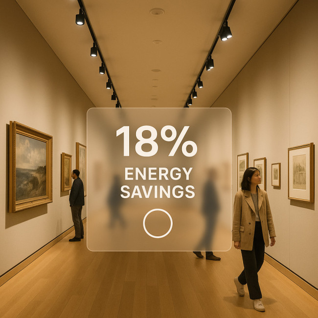
Reducing unnecessary footfall loops trims both energy and cleaning cycles. When HVAC zones react to real-time occupancy data, some museums report annual energy savings of 12–18 %. Multiply that by exhibition frequency, and analytics rapidly pay for themselves while cutting carbon. These efficiency gains not only lower operational costs but also build compelling evidence for climate-conscious stakeholders who increasingly demand measurable action from cultural institutions, ensuring future funding eligibility and enhancing reputational resilience in a sector where transparency around sustainability is becoming non-negotiable.
Align with funding criteria
Many cultural grants now prioritise measurable environmental impact. Present before/after CO₂-per-visitor charts alongside NPS gains to satisfy both green and audience-engagement criteria in a single dashboard.
Common implementation pitfalls
- Data siloing: Ops teams collect numbers that curators never see. Schedule joint reviews every fortnight.
- Vanity metrics: A raw visitor count jump looks great until you note that average dwell time plummeted. Balance quantity with quality.
- Over-tracking: More sensors do not equal better insights. Start small, focusing on two KPIs tied to revenue.
Quick self-test: are you analytics-ready?
FAQ
- Is visitor flow analytics expensive to deploy?
- Entry-level IoT sensors and open-source dashboards can start under €3 000 for a mid-sized exhibit, often offset within one season by higher shop conversions.
- How do analytics improve sustainability?
- Optimised paths cut lighting, HVAC and cleaning footprints by reducing dead-zone usage and evening out occupancy peaks.
- Will tracking breach GDPR?
- Anonymous counting technologies avoid storing personal data. Always display clear signage and offer opt-out Wi-Fi networks to stay compliant.
- How soon should I expect ROI uplift?
- Most venues record measurable gains—longer dwell time or higher per-capita spend—within the first 8–12 weeks of iterative layout testing.
- Do I need a data scientist on staff?
- Not necessarily. Many analytics platforms translate sensor feeds into plain-language insights, and staff can upskill via short courses.
Take the next step
Ready to turn footfall into sustainable profit? Map one visitor journey this week, set a baseline KPI, and schedule your first A/B zoning weekend. Small, data-driven moves snowball into exhibitions that delight guests, impress funders, and protect the planet.
Act now: Book a discovery call with our spatial analytics team and see how a 30-day pilot can multiply your exhibition ROI.
