Visual branding sync: align directory photos, socials and stage looks for impact
A seamless visual identity makes bookers trust you before they even press “play”. This guide shows you how to align directory thumbnails, social feeds and live costumes so every touch-point tells the same story and drives more paid gigs.
Why visual consistency multiplies bookings
You have seconds to impress a scrolling recruiter. If your profile photo, Instagram grid and last night's stage outfit feel disjointed, viewers doubt your professionalism. When colours, lighting and styling match, memory recall shoots up and decision time drops. Consistency also feeds directory algorithms that reward coherent galleries with higher rankings, as explained in this deep-dive on algorithm triggers.
The trust triangle
- Recognition: A fan who spots your signature palette on a male dancer directory listing links it instantly to your latest reel.
- Reliability: Producers assume equal care goes into punctuality and performance when visuals look deliberate.
- Recall: Matching looks lower cognitive load, helping casting teams remember your name during shortlisting.
Build a reference palette
Start by extracting three core colours from your strongest shoot. Online tools such as Adobe Color or free eyedropper plugins help. Stick to:
- One dominant hue (backgrounds or costumes).
- One accent (accessories, typography).
- One neutral (skin-tone flattering shadow).
These tones guide lighting gels, wardrobe pulls and social overlays. For further inspiration, read how subtle costume tweaks lift click-through rates in this wardrobe strategy article.
Directory photos: your first handshake
Thumbnail rules that convert
- Cropping: Forehead to mid-chest framing keeps facial expression readable even at 150 px.
- Background control: Use a plain or lightly textured backdrop in your dominant hue.
- Lighting: Mimic stage rig—soft key light plus subtle rim for depth. Avoid colour casts that clash with your palette.
Upload at least three variations: portrait, mid-shot and a dynamic full-body. Rotate seasonally to feed algorithms and show versatility.
Metadata matters
File names and alt text should include style, colour and role. Example: b-boy-electric-blue-freeze.jpg. This boosts discoverability and supports accessibility plugins, covered in our analytics playbook.
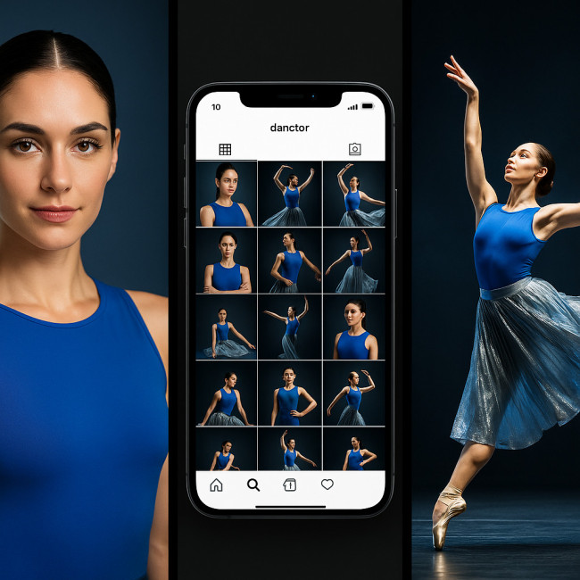
Social media grids: extend the story
Think of your nine most recent posts as a mini-website. Recruiters often jump from directory to Instagram to validate recency and crowd reaction.
Three-post cadence
- Hero still: Close-up echoing your directory headshot.
- Motion snippet: 15-second clip in matching costume and lighting.
- Backstage detail: Shoe, fabric or prop shot featuring your accent colour.
Repeat this pattern. It keeps the feed fresh while safeguarding visual cohesion.
Caption chemistry
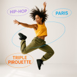
- Lead with the gig's core emotion: “Electric energy on the Paris stage ⚡”.
- Tag collaborators and venues for amplification.
- Close with a booking CTA and matching emoji colour (e.g., blue heart if blue is dominant).
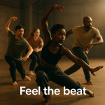
Stage looks: living brand assets
Costumes and lighting are marketing channels visible to hundreds of live spectators and countless viewers online. Align them with your digital palette. Provide your lighting designer with your hex codes so gels and gobos complement outfits.
Wardrobe checklist
| Element | Directory | Socials | Stage |
|---|---|---|---|
| Dominant colour | Backdrop | Feed borders | Costume main fabric |
| Accent colour | Wardrobe accessory | Text overlay | Props or trim |
| Neutral tone | Skin-flattering light | Background drop-shadow | Follow-spot temperature |
Workflow: keeping assets synced
1. Pre-production board
Collect colour swatches, fabric samples and lighting references into one cloud doc. Share with choreographers, photographers and stylists.
2. Shoot day batch content
During photo day capture:
- Headshots for directory updates.
- Reel snippets formatted 4:5 and 16:9 for socials.
- B-roll for stories and backstage teasers.
3. Post-production delivery
Edit presets lock hues across stills and video. Export LUTs for videographers so future clips match.
4. Quarterly audit
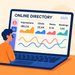
Compare directory impressions, social saves and enquiry volume. Replace underperforming images and tweak palette saturation if needed.
Common pitfalls and easy fixes
- Random collaborator tags: Unvetted reposts break palette consistency. Ask for approval before sharing edits.
- Venue lighting surprises: Send your colour bible to technical directors early.
- Over-filtering: Heavy Instagram filters distort skin tones. Use subtle curves instead.
Quick visual branding quiz
FAQ
- Do I need a professional photographer for directory shots?
- Yes. A pro ensures consistent lighting and colour accuracy that phone snapshots rarely achieve. The investment pays off in higher shortlist rates.
- How can I test if my visuals feel cohesive?
- Create a nine-tile collage mixing directory thumbnails, recent posts and a stage photo. If no square looks out of place, you are on track.
- What if a client requests colours outside my palette?
- Adapt accessories or secondary costumes while keeping at least two core palette elements intact, maintaining brand recognisability without appearing rigid.
Key takeaways
- Choose a three-colour palette and apply it everywhere.
- Batch-produce assets so directory, socials and stage never drift apart.
- Audit quarterly, adjusting underperforming visuals before peak booking seasons.
Ready to elevate your visuals?
Syncing branding is easier with the right tools and workflows. Follow the shooting tips in our video framing guide, then schedule your palette audit this week.