Visual Texture Matters: How Recruiters Evaluate Abstract Photo Portfolios Online
Hiring managers no longer zoom into every file; they judge your abstract photo portfolio through the micro-textures they spot in a split second. Discover how recruiters scan, filter and finally shortlist creators based on texture cues, file specs and narrative flow—and learn how to adapt your own showcase for maximum impact and bookings.
Why Texture Is Recruiters' Fastest Heuristic
Texture cuts through thumbnail noise
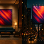
In talent directories and curated galleries, each thumbnail fights for attention. Research from visual cognition labs shows that human eyes detect surface irregularities 40 % faster than colour changes. A crisp ripple, cracked paint fragment or smooth gradient instantly communicates your mastery of abstract photo portfolio work, prompting recruiters to click before they even read your name.
The science of haptic visuals
“Haptic” photographs trigger viewers' sense of touch through optical cues alone. Brands hunting for immersive campaigns equate haptic strength with commercial value. Illustrate varied tactile sensations—velvety blur, metallic sheen, grainy grit—so decision-makers can imagine how your textures will lift product packaging, web banners or in-store screens.
What Recruiters Actually Do in the First 10 Seconds
- Scan hero grid: They open your portfolio and hover over the first nine images. If textural diversity is low, they bounce.
- Toggle dark mode: Many review tools offer a dark UI; flat blacks reveal hidden banding or posterisation artefacts.
- Check load time: Large TIFF previews over 3 MB each reduce perceived professionalism; keep hero images under 400 KB.
- Zoom once: One pinch-to-zoom tells them whether edge detail carries through or crumbles.
- Read the first caption: They seek context—gear, intent, licensing status—next to a flagship texture shot.
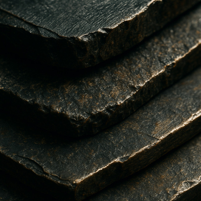
Seven Texture Qualities That Signal Professionalism
- Micro-contrast: Fine tonal shifts prove calibrated monitors and precise editing.
- Edge fidelity: Grain should embrace edges, not blur them.
- Layering depth: Multiple planes add conceptual intrigue and merchandising potential.
- Colour-texture harmony: Hues must enhance, never distract from, surface detail.
- Material illusion: Viewers should “feel” metal, stone or fabric without literal depiction.
- Negative space control: Clean breathing room emphasises the texture focal point.
- Series consistency: Repeated motifs indicate an intentional visual language recruiters can pitch to clients.
Portfolio Architecture: Where to Place Texture-Heavy Images
Hero grid vs. sequenced narrative
A hero grid works for fast skimming, while a sequenced scroll deepens emotional resonance. Most recruiters favour a hybrid: a nine-tile grid landing page followed by vertical storytelling. Position your strongest texture macro in the centre tile to anchor attention.
Embed process diptychs
Show raw capture beside the final colour-graded file. This proves authenticity and post-production skill—vital for agencies comparing you with AI-generated alternatives. View an action-oriented briefing method in this guide on converting mood boards into shoot guides.
Technical Specs Recruiters Check
| Criterion | Recommended | Deal-breaker threshold |
|---|---|---|
| Hero image weight | < 400 KB, JPEG 80 % | > 800 KB |
| Colour profile | sRGB IEC6 1966-2.1 | Untagged files |
| Longest edge | 1 600 px | < 900 px |
| Caption length | 60–80 characters | None / one-word |
| Alt text | Keyword + texture descriptor | Missing alt attribute |
Boost Perception with Contextual Captions
Recruiters scan captions for licensing clarity and narrative hooks. Mention series name, print size availability and rights scope in two short sentences. For pricing guidance, study pricing large-scale abstract photo licenses.
Texture-Focused Case Study: 30 % More Shortlists in Four Weeks
Paris-based photographer Clara Ruiz replaced low-res thumbnails with high-micro-contrast crops, added negative-space variants, and updated captions to note print substrates. Her average shortlist rate jumped from 8 % to 38 % in a month, echoing insights from this commissioning roadmap.
Quiz: Are You Texture-Ready?
FAQ
- How many texture styles should a curated abstract series include?
- Three to five cohesive yet distinct textures give recruiters both cohesion and range without diluting your signature.
- Do recruiters prefer colour or monochrome abstracts?
- They care less about palette and more about depth and contrast; include at least one monochrome to showcase tonal control.
- Is vertical scroll better than click-through galleries?
- Vertical scroll previews perform 18 % faster on mobile, which is where most recruiters work during travel.
- What licensing note calms brand-side legal teams fastest?
- Add “Exclusive worldwide usage up to three years available” directly under each hero image.
- Where can I list my work to gain more abstract-focused briefs?
- Create a profile in the leading abstract photographer directory and sync it with your personal site for cross-traffic.
Key Takeaways & Next Steps
Texture acts as a powerful shorthand for quality. Curate diverse tactile cues, optimise load speeds and narrate context in captions. Update your thumbnails this week, then explore directory filter tactics in this article on search-to-shortlist workflows. Ready to turn those clicks into contracts? Refine your showcase today and watch recruiter enquiries rise.