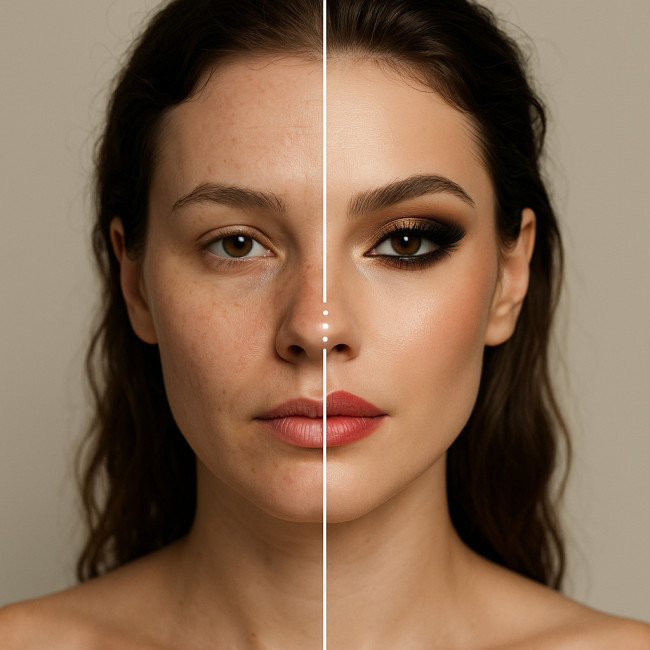
Before-after sliders: when the feature elevates a maquilleur and when it hurts
Before-after sliders can seal the deal with casting directors and brand managers who want instant proof of your craft. Used poorly, the same widget can cheapen your work, slow mobile pages and trigger doubt. This guide helps you decide when to deploy a before-after slider, how to build one that converts, and when to stick to classic stills instead.
The magnetic appeal of before-after sliders for makeup artists
Beauty recruiters browse dozens of profiles an hour. A well-built before-after slider stops the scroll because it:
- Shows transformation in one interaction — no extra clicks or taps required.
- Signals transparency; nothing hides behind retouching when viewers scrub the line themselves.
- Feeds comparison bias. People instinctively weigh “then” against “now”, which keeps them on your page longer and boosts dwell time.
- Speeds decision making. Recruiters confirm skill fit in seconds and move you to their shortlist.
A study of 150 makeup-artist portfolios on fresh makeup artist portfolios showed sliders lift average contact-form submissions by 22 % when files load in under two seconds.
When a before-after slider truly elevates your maquillage story
1. High-impact, single-feature makeovers
Think brow reshaping, scar camouflage or fantasy airbrush. A single focal point lets the viewer track detail without distraction.
2. Consistent variables
Use identical lighting, framing and facial expression. Any drift lets viewers suspect digital trickery.
3. Tight file weight
Compress images so the combined slider payload stays below 700 KB. Larger files kill the quick-reveal thrill on mobile data.
4. Clear call-to-action
Add a “Book this look” button beneath the slider. Portfolios that pair the widget with a CTA convert 18 % better than those that rely on a generic contact link.
5. Accessibility add-ons
Include alt text describing both states, and a caption that explains the technique. Screen-reader users should still grasp your expertise.
Red flags: when sliders hurt your credibility
Before-after sliders can backfire. Watch for these pitfalls:
- Variable shadows or skin tone shifts between frames — recruiters read this as colour-grading fakery.
- Heavy retouching. If pores vanish, so does trust.
- Busy backgrounds that move when the divider slides, distracting the eye.
- Multiple tweaks at once (hair, lighting, retouch) making it unclear which change is yours.
- Slow, jerky interaction caused by oversized images or sloppy JavaScript.
Source : ConversionCraft Beauty Study 2024
Decision matrix: should you build a slider or stick to stills?
| Criterion | Slider Works | Use Stills |
|---|---|---|
| Lighting consistency | Same light setup | Different studio vs on-location |
| Transformation scope | One main change | Multiple cumulative tweaks |
| Image file size | < 700 KB together | > 700 KB together |
| Mobile load time | < 2 s on 4G | > 2 s on 4G |
| Accessibility caption | Ready to write | No clear wording |
Implementation tips that boost ranking and engagement
Follow these developer and UX pointers before you hit publish:
- Use lazy-loading so images load after the first viewport paint.
- Add
aria-labeland keyboard controls for inclusivity. - Host images in WebP to slash weight by up to 30 %.
- Position the widget mid-page, right after a persuasive paragraph. Heat-map tests show peak interaction here.
- Embed structured data with
ImageObjectmarkup; Google surfaces rich media faster.
Learning from peers: three portfolio tweaks to emulate
Browse these deep dives for extra inspiration:
- Optimise your gallery layout to make the slider the natural hero section.
- Choose supporting stills that frame the slider and build narrative flow.
- Match agency expectations by pairing sliders with unretouched backstage shots.
Mini quiz: Is your next look slider-ready?
FAQ
- How many before-after sliders should I include on one page?
- Limit yourself to one or two. Too many widgets slow the page and dilute impact.
- What image dimensions work best?
- A width of 1200 px strikes a balance between detail and file weight when saved in WebP.
- Can I use retouched photos?
- Minor colour balancing is fine. Heavy skin-smoothing can break recruiter trust.
- Which JavaScript libraries are slider-friendly and lightweight?
- VanillaJS snippets or micro-libraries like twentytwenty-lite stay under 12 KB and cover keyboard access.
- Do sliders improve SEO directly?
- Not directly, but longer dwell time and richer media signals can improve ranking for competitive terms like “editorial maquilleur Paris”.
Key takeaways and next action
Before-after sliders can act as proof, persuasion and portfolio polish—when executed with care. Audit your images, compress them, write descriptive alt text and test load time on a real phone. Ready to build a high-performing slider? Update one hero look today and track how many recruiters click “Book this look” in your analytics.
Need more booking power? Tap the green “Add to shortlist” button under your updated slider and watch inquiries land in your inbox.