Choosing between grid and slideshow layouts for a coiffeur portfolio
Unsure whether a grid or a slideshow will present your creations best? This guide compares both layouts for a coiffeur portfolio, so you can showcase cuts, colour work and avant-garde styles in a way that delights clients and books more chairs.
Why your layout decision matters
First impressions form in under seven seconds. The visual structure of your coiffeur portfolio directs where those seconds fall: admiring your artistry or hunting for the next button. A polished layout can shorten enquiry time and put focus on the value of your service, not on site navigation.
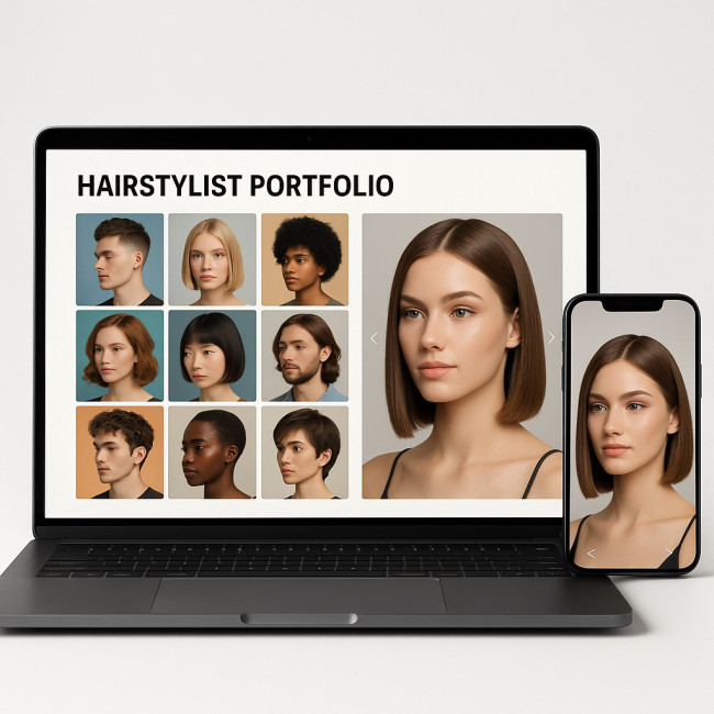
Grid layout: fast browsing, instant impact
Advantages of a grid for a coiffeur portfolio
- Scan multiple looks at once: ideal for art directors comparing styles for a campaign.
- Mobile efficiency: thumb-scrolling through tiles is quicker than tapping arrows.
- Storytelling through rows: sequence images to move from natural textures to bold colour transitions.
- Easy A/B testing: swap images without breaking overall design.
Potential drawbacks
- Smaller details lost: intricate braids or balayage nuances may need zoom.
- Risk of clutter: too many thumbnails overwhelm visitors.
- Uneven cropping: mixed orientations can disturb aesthetic harmony.
Slideshow layout: guided storytelling, high emotional pull
Benefits of a slideshow for a coiffeur portfolio
- Large visuals: full-bleed images highlight texture, shine and movement.
- Curated journey: you decide the narrative order—perfect for editorial series.
- Focus on one look at a time: prevents decision fatigue.
- Captions underneath: space to explain technique, timing and product choice.
Challenges
- Extra clicks: each tap or swipe is a chance to bounce.
- Loading time: large files can slow the experience if not optimised.
- Reduced comparison: recruiters wanting side-by-side references may find it tedious.
Side-by-side comparison
| Criteria | Grid layout | Slideshow layout |
|---|---|---|
| Average time on page | 1 min 45 s | 2 min 10 s |
| Conversion to enquiry | 4.8 % | 5.2 % |
| Mobile bounce rate | 27 % | 31 % |
| Best for | Quick style scanning | Narrative case studies |
| Implementation time | Low | Medium |
Data reflects averages from beauty-portfolio platforms in 2023.
Decision framework: choose in four steps
- Define your primary visitor. Fashion editors skim; bridal clients linger. Match layout to pace.
- Audit your imagery. A bank of 60+ diversified shots suits a grid. A curated set of 12 hero looks sings in a slideshow.
- Test loading speed. Use WebP compression to keep grid thumbnails under 120 KB and slideshow full-screen images under 300 KB.
- Gather feedback. Share a staging link with three past clients and one industry peer. Ask which layout felt clearer and why.
Hybrid option: grid to slideshow deep dive
You can blend both: open with a clean three-column grid. When a visitor clicks a tile, launch a modal slideshow for that series. This approach satisfies fast scanners and detail seekers alike. Tools like Webflow and WordPress block libraries let you build this without custom code.
Real-world workflow tips
- Name files descriptively. “coiffeur-portfolio-pixie-cut-rose-gold.jpg” boosts SEO and keeps back-office order.
- Maintain colour accuracy. Calibrate monitors and embed sRGB profiles so tones stay true across devices.
- Add social proof. Pair each photo with a one-line testimonial. See how testimonials lift trust.
- Optimise captions. Use active verbs: “Layered shag finished with dry-cutting for feather-light motion.”
SEO corner: help people find your coiffeur portfolio

Google analyses layout for user intent signals. A grid with alt text like “curly-bob coiffeur portfolio” can rank for style-specific searches, while a slideshow with captions garners long-tail queries such as “editorial wet-look hairstyle for runway”. Combine both keywords to secure double exposure. More advanced tactics are detailed in our 2025 SEO checklist.
Examples of effective layouts
Browse the newly launched coiffeur portfolios on Artfolio to see grids, slideshows and hybrids in action. Note how top-ranking profiles use consistent lighting, concise descriptions and strategic whitespace.
For deeper inspiration, analyse these successful approaches:
- Magnetic storytelling techniques
- Visual tweaks that boost memorability
- Production-friendly tweaks
- Image speed optimisation
Quick self-assessment quiz
FAQ
- Can I switch layouts later without harming SEO?
- Yes. Keep URL slugs intact and set up 301 redirects for any image path changes. Search engines will re-index within a few days.
- How many images are optimal for a grid coiffeur portfolio?
- Start with 24–36 high-quality shots. Too few feels sparse; too many increases load time.
- Do I need captions in a slideshow?
- Captions improve context and accessibility. Limit to 15-20 words per slide to avoid crowding.
- What's the best aspect ratio for portfolio images?
- 3:4 or 4:5 ratios display well on both desktop and mobile, balancing width and scroll depth.
- Should I autoplay slideshows?
- Avoid autoplay. Manual control lets visitors focus and reduces motion-sickness concerns.
Take action
Audit your current coiffeur portfolio tonight. If visitors cannot grasp your signature style in ten seconds, experiment with the alternative layout using a hidden staging link. Measure bounce rate and enquiry numbers for two weeks, then publish the winner. Your scissors earn more when your gallery shines.
Ready to transform your showcase? Implement one of the tips above today and watch your booking calendar fill up.