Colour grading consistency: a quick test to judge new online photographer reels
Scrolling through fresh photographer showreels is exciting—until three clips in a row shift from teal to magenta and back again. Colour grading consistency is one of the fastest visual signals of professionalism. In five minutes, you can run a simple test that separates polished reel curators from hobbyists. Follow the steps below, add the checklist to your own evaluation workflow, and you will shortlist talent with far more confidence.
Why colour grading consistency matters in first-look screenings
Human vision hunts for patterns. When a reel's palette swings wildly, your brain flags risk: “Will this photographer deliver a coherent final gallery?” A 2023 Behance portfolio audit found that 68 % of creative directors rejected reels with obvious colour shifts after the first 30 seconds. Consistency communicates technical skill, brand alignment and post-production discipline—the trio every client wants.
Colour discipline also boosts discoverability. Platforms such as Artfolio's new-portfolio feed surface creators whose thumbnails share a recognisable tonal mood, driving higher click-through rates.
The five-minute colour consistency test
1. Capture reference frames
- Play the reel once, pausing every 7–10 seconds.
- Take a screenshot of each pause; aim for 8–10 frames total.
- Drop the images into a blank folder named “Reel Test”.
2. Build a quick-contact sheet
- On macOS, select all images, right-click > Quick Actions > Create Contact Sheet.
- On Windows, open PowerPoint, insert all images on one slide and export as PNG.
3. Sample the dominant hues
Open the contact sheet in any editor with an eyedropper tool (Figma, Photoshop, even free Photopea). Click three spots per frame—skin, mid-tone background, high-light—and jot down the HEX codes.
4. Check Delta E variance
Drop the HEX list into an online Delta E calculator. A variance under 6 between similar scene types is considered professionally consistent. Anything above 10 signals poor grading control.
5. Score and decide
| Delta E Range | Verdict | Action |
|---|---|---|
| 0 – 5 | Excellent parity | Add to shortlist |
| 6 – 9 | Minor drift | Request full gallery |
| 10 + | High inconsistency | Decline or seek clarification |
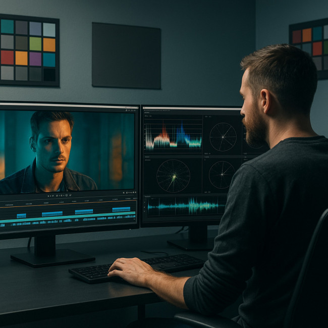
Tools that speed up the process
- Frame.io Compare – drag two frames side by side and auto-read RGB variance.
- DaVinci Resolve Mini (free) – import the reel, switch to Gallery view, and eyeball waveform scopes for each clip.
- Palette.fm Plug-in – generates instant colour maps and numeric reports.
Interpreting common colour issues
Below are pitfalls you will spot once you start running the test:
- Mixed lighting temps – tungsten interiors cut with daylight exteriors without balancing gels.
- LUT stacking – creator adds multiple lookup tables, crushing blacks and blowing highlights.
- Camera body switch – two cameras with divergent colour science used in the same scene.
- Over-correction for style – aggressive teal-orange grade hides original mood and skin realism.
Best practices photographers should follow (and you should expect)
If you notice the tips below implemented, odds are high the shooter masters colour control:
- Grey-card or color-checker shot at the start of every location.
- Unified white-balance presets across cameras.
- Scene-based LUTs loaded only once per timeline.
- Final pass in a calibrated environment (monitor with 6500 K, 120 cd/m²).
For an in-depth breakdown of how creative directors review full bodies of work, see our guide on reading new photographer portfolios like a creative director.
Quick checklist before you hit “Book”
- Run the five-minute test—log your Delta E.
- Skim their gallery thumbnails—do they echo the reel grade?
- Cross-reference stills shared in briefs or on social feeds.
- Confirm whether the photographer offers colour-matched deliverables (print + web).
- Ask about monitor calibration reports if your campaign demands tight brand colours.
Beyond colour: complementary evaluation steps
Colour is step one. Next, eyeball lighting diversity to avoid galleries that feel flat. Our article on lighting diversity in galleries outlines a two-minute ambient-contrast scan you can add right after the colour test.
Finally, remember that a cohesive reel still needs an audience. If you are a photographer reading this, learn how to push your polished reel to the top of search results with SEO tweaks for new photo portfolios.
Mini quiz: are your eyes calibrated?
FAQ
- Does minor colour drift ever matter in lifestyle reels?
- Yes. Even subtle shifts can alter fabric tones or skin warmth, causing brand colours to misrepresent in campaigns.
- Can auto-white balance fix everything?
- No. AWB can reduce extremes but still introduces flicker when lighting changes. Manual, locked settings remain safest.
- What if a photographer shoots log profiles?
- Log is fine as long as the final grade matches across clips. Ask to see finished versions, not just flat footage.
- Is Delta E testing overkill for social media projects?
- Not if you value brand consistency. Audiences notice colour jumps even on mobile screens.
- Should I request RAW files to re-grade myself?
- Only if your production has post-house resources. Otherwise, focus on hiring photographers who already nail the grade.
Action step
Download the checklist, run the test on your next round of reel submissions and book talent whose colour discipline matches your brand palette. Your campaign visuals—and your deadlines—will thank you.