Creating an impact section: showcase awards and press without overdoing bragging
Your portfolio deserves a spotlight moment, yet nobody enjoys self-promotion that smells of ego. An “Impact” section—one tidy block that blends awards, press mentions and numbers—signals quality while keeping the browsing experience smooth. Follow this guide to build a concise, confidence-inspiring showcase that converts visitors into brief-sending clients.
Why an “Impact” section works
First impressions online happen in seconds. By centralising social proof you:
- Reassure recruiters who need proof you deliver results.
- Keep navigation clean—no endless scrolling for credibility.
- Control the tone: you celebrate milestones without scattering bragging copy everywhere.
Platforms that curate new talent, such as Artfolio's fresh portfolio list, favour profiles that communicate value fast. A sharp Impact block gives you that edge.
Choose the right accomplishments
1. Prioritise relevance over volume
List a maximum of five highlights. A Cannes Lion from 2019 beats ten local press clippings from last week. Ask: “Will this fact make a recruiter trust me more for the brief I want today?” If no, cut it.
2. Mix quality signals
- Awards: Industry juried prizes, festival selections, grants won.
- Press quotes: One-line pull-quotes from recognised outlets.
- Hard metrics: “Campaign drove 3 M views” or “Booked by 50+ brands”.
3. Keep each item scannable
Use a three-part formula:
- Badge/logo (small, retina-ready SVG or PNG, 100 px max height).
- Headline (5–7 words).
- Context line (10–12 words giving year and why it matters).
Layout options that feel humble yet persuasive
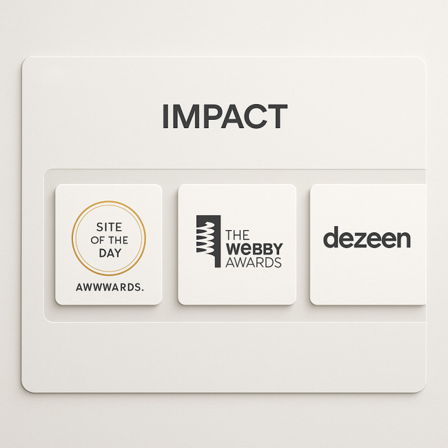
Picture a horizontal strip sliding gently into view, its charcoal background making off-white cards glow. Card one hosts a golden Lion trophy icon, card two frames the monochrome masthead of The New York Times, card three highlights a bold data point like “+3 M views”. Generous padding keeps the layout airy so nothing feels cramped. Subtle drop shadows cue clickability, and micro-animations on hover reveal each context line without hijacking attention. The refined motion design feels friendly rather than boastful, proving you care about craft as much as credentials, while responsive scaling ensures the strip remains elegant from widescreen desktop down to single-hand mobile browsing.
| Format | Best for | Why it works |
|---|---|---|
| Horizontal ticker | Minimalist portfolios | Glides above the fold, stays compact on mobile. |
| Two-column grid | Medium to large screens | Balances logos and quotes, avoids vertical bloat. |
| Masonry cards | Visual artists with mixed media | Accommodates different logo sizes gracefully. |
Tone guidelines: celebrate, don't brag
- Write in third person only if you use a short biography style. Otherwise stay in first person plural (“I/We”) for authenticity.
- Swap superlatives for facts: “Selected for PDN's 30” beats “World-class photographer”.
- Edit adjectives; nouns carry more weight. “Vogue” says more than “prestigious magazine”.
Integrate the Impact block smoothly
Position matters. Tests on creative directory profiles show recruiters skim in this order: hero image, services, social proof, portfolio grid. Place the Impact section just before or after your main gallery to align with that flow.
Don't bury it in navigation
A separate “Awards” page forces extra clicks and inflates bounce rate. Keep the block on your homepage or profile root. For more UX improvements, see image-speed tactics that slash bounces.
Blend Impact with other trust cues
Add one testimonial slider underneath; human voices complement objective accolades. Learn how to do this gracefully in our testimonial integration guide.
Step-by-step build-out checklist
- Collect assets: source high-resolution award logos, press mastheads, analytics screenshots.
- Compress PNG/SVGs: keep each under 40 KB to stay fast.
- Draft copy: 50–60 characters per headline, 90 characters context.
- Design for dark & light mode: logos need transparent or adaptable backgrounds.
- Mobile test: two-row wrap, touch-friendly 16 px text min.
- Update quarterly: retire dated wins, add fresh metrics.
Common mistakes and quick fixes
- Out-of-context numbers: “10K followers” means little; “10K followers after one month” tells a story.
- Dead links: Press logos should link to the article PDF or live page.
- Logo overload: Six tiny badges equal clutter. Curate three.
- Inconsistent dates: List years in descending order so viewers track growth logically.
Advanced moves to stand out
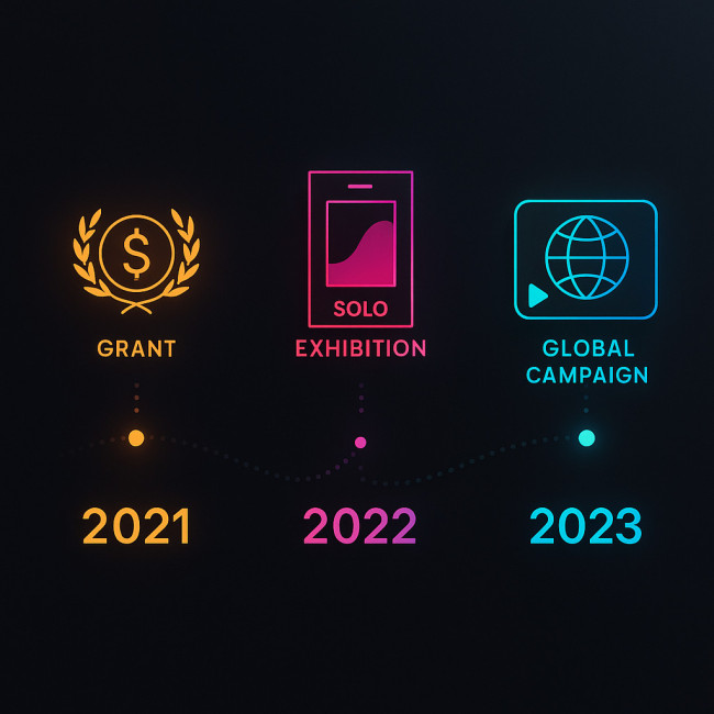
Imagine an animated timeline unfurling across the screen from left to right. A 2021 grant medal blossoms into full colour, followed by a 2022 solo-show poster that lifts softly, then a 2023 global campaign thumbnail that pulses once for emphasis. Connecting the milestones, a dotted line grows with each scroll tick, underscoring momentum. Hovering reveals tiny data balloons—conversion increases, press reach, funding totals—that transform static trophies into living narratives. The entire treatment relies on lightweight SVG sprites and lazy-loaded WebP thumbnails, so even mid-range mobiles keep 60 fps fluidity. Most importantly, the restrained palette and unhurried motion convey confidence without arrogance, letting the story of continuous improvement speak for itself.
Show growth trajectories
Add a mini timeline: 2021 grant → 2022 solo show → 2023 global campaign. Recruiters love upward curves.
Embed micro-case studies
Hover states can reveal a one-sentence result: “Campaign conversion rate +37 %”. This transforms a static logo into a data story.
Combine with narrative visuals
If your work relies on storytelling, pair each accolade with a thumbnail that leads to a project page. Explore additional narrative hooks in this storytelling tweak tutorial.
FAQ
- How many awards should I display?
- Three to five curated wins keep the block powerful without clutter.
- Can I include client logos?
- Yes, but separate them from awards. Client rosters work better in a “Trusted by” strip.
- What if I have no major prizes yet?
- Lead with press quotes, data metrics or testimonials until you secure formal awards.
- Should each logo link out?
- Absolutely. Provide proof via press articles, award listings or certificates.
- How often do I update the Impact section?
- Quarterly is ideal. Replace older mentions with fresh results to show momentum.
Quick self-assessment quiz
Action plan in one minute
- Pick your top five wins—awards, press, metrics.
- Design a responsive two-column grid and compress logos.
- Add concise copy and proof links.
- Publish the block above your portfolio gallery.
- Set a calendar reminder every three months to refresh.
Implement these steps today to transform silent credentials into a persuasive yet modest impact narrative. Visitors will feel confident, and your inbox will feel busier.