Colour theory for garment design: online articles to master palettes and contrast
A flawless cut loses impact if the palette falls flat. By mastering colour theory, you transform sketches into garments that sell, withstand trend cycles and flatter every body. This guide distils the essentials, points you to the best online reads and hands you practical tools to sharpen your eye—fast.
Why colour theory is your silent sales pitch
Fabric quality, silhouette and price influence buyers, yet colour is the cue most shoppers process first. A 2023 study on retail decision-making reveals that 85 % of consumers name colour as the main reason for selecting one product over another. When palettes harmonise with skin tone, cultural context and brand DNA, conversion rates rise and return rates fall. In short, colour choices speak before marketing does.
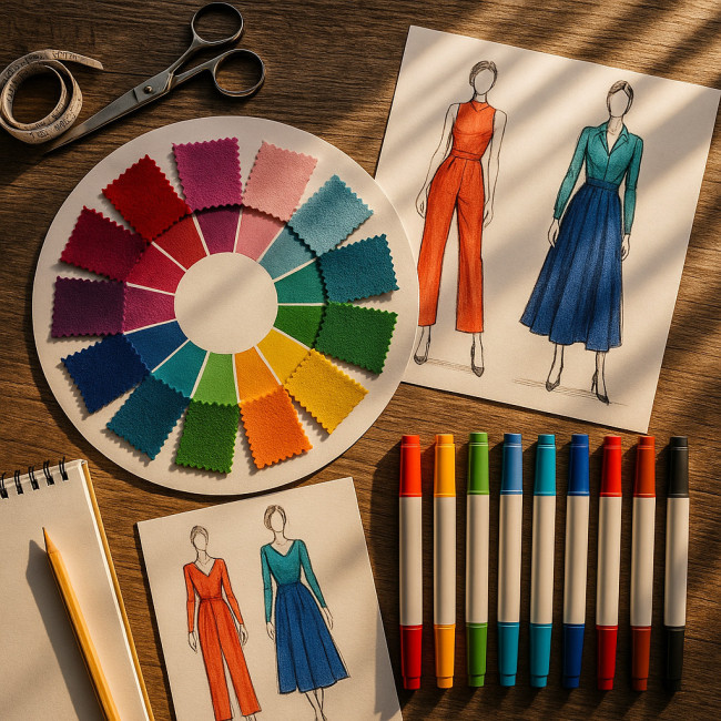
The three pillars: hue, value and chroma
Hue: setting the emotional temperature
Hue categorises pure colours on the wheel—reds signal passion, blues stability, greens sustainability. Decide the story your collection should tell, then shortlist 3-4 keynote hues to anchor every look.
Value: the lightness–darkness spectrum
Value controls legibility and silhouette sculpting. Lighter values enlarge, darker values recede. Mixing values in strategic panels can highlight or downplay body zones without redesigning the pattern block.
Chroma: intensity that dictates mood
High-chroma fabrics energise streetwear; muted chroma ensures corporate versatility. Dial chroma up or down to match target occasions and price points.
Building a garment palette in five steps
- Define the brand narrative. Is the message bold rebellion or mindful minimalism? Narrative guides hue family.
- Create a value ladder. Pick at least one shade in light, mid and dark ranges to enable layering.
- Select accent colours. Choose 10 – 20 % of the palette in high chroma for trims and graphics.
- Test on skin tones. Drape swatches across diverse complexions to avoid accidental wash-outs.
- Stress-test under lighting. Check colours under daylight, warm retail LEDs and cool studio spots.
Contrast mastery: beyond black & white
Effective contrast separates panels, clarifies prints and ensures accessibility for colour-blind wearers.
- Value contrast is king for silhouette definition. Aim for at least a 30 % lightness gap between adjoining zones.
- Hue contrast adds vibrancy: pair opposites such as teal and coral for maximum pop.
- Temperature contrast (warm vs cool) keeps a monochrome capsule interesting—think charcoal with a cold blue undertone against warm greys.
Contrast checklist for production files
| Design Goal | Recommended Contrast Type | Practical Ratio |
|---|---|---|
| Logo visibility on tees | Value | 4.5:1 WCAG guideline |
| Print blocking on dresses | Hue | ≥120° colour-wheel distance |
| Adaptive wear for low vision | Value + Chroma | 7:1 WCAG AAA |
| Subtle luxury suiting | Temperature | Warm vs cool neutrals ±5 % value |
Level up with curated online reading
Deep dives keep your palette fresh. Start with these expert picks:
- Sharpen your sizing intuition alongside colour by reading the inclusive sizing playbook.
- Cross-reference cutting guides with the free pattern-making resources roadmap to align shapes and shades.
- Forecast next season's must-have tints using the trend-forecasting tools toolkit.
- Source eco-friendly dyes once you've set a palette by exploring sustainable designer sourcing strategies.
For structured lessons, many professionals bookmark the clothing-designer training hub, which curates course lists on colour application and testing.
Five frequent colour mistakes and easy fixes
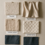
- Ignoring fibre influence. Natural fibres absorb dye differently from synthetics—run lab dips per material.
- Overusing complementary schemes. They pop but tire the eye; temper them with a neutral buffer.
- Printing without ICC profiles. Your vivid magenta may dull on sublimation. Calibrate devices.
- Skipping wearer context. Resort garments demand brighter hues than urban workwear; plan distribution channels first.
- Neglecting repeatability. Record Pantone or CSI references for every batch to avoid heartbreak in reorders.
Interactive quick test: spot the palette flaw
FAQ
- How many colours should a cohesive collection include?
- A capsule can thrive on 3–5 core hues, with two neutrals and one accent for flexibility across looks.
- What is the safest contrast ratio for fashion e-commerce images?
- A minimum 4.5:1 value contrast between garment and background ensures details remain visible on all screens.
- Can I rely on on-screen colours when ordering fabric?
- No. Always request lab dips or strike-offs; monitor calibration varies wildly, and RGB cannot fully represent dyed fabric.
- Which colour harmony sells best worldwide?
- Analogous schemes (three neighbouring hues) consistently perform well because they feel balanced across cultures.
- Do sustainable dyes limit palette options?
- The range was limited a decade ago, but modern low-impact dyes cover 95 % of Pantone shades, including neons.
Ready to turn theory into profit?

Colour mastery boosts perceived quality and basket value. Start testing palettes today, document every swatch and let data, not guesswork, steer your next collection. Need deeper guidance or supplier intros? Contact our studio for a personalised colour audit and make every hue earn its keep.