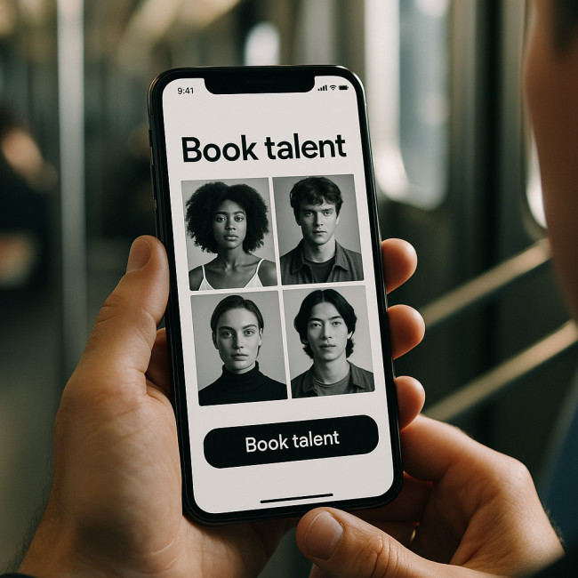
Mobile-first portfolios: design tweaks that load fast and keep directors engaged
Your portfolio often lands in a director's hand on a commuter train or a film-set location scout's phone. This guide shows you how to craft mobile-first portfolios that load in under two seconds, feel intuitive in one thumb and persuade decision-makers to hit “Book talent” instead of “Back”.
Why mobile-first portfolios decide the casting call
More than 76 % of creative-industry recruiters browse talent on smartphones. A slow site or cluttered gallery turns that first scroll into an exit. Build mobile-first portfolios and you:
- Meet Google Core Web Vitals, boosting search ranking and visibility.
- Ensure assets display crisply on high-DPI devices directors love.
- Remove friction in the first five seconds—the attention span of a time-pressed casting director.
Speed foundations: audit and trim
Compress visuals without losing drama
High-resolution looks drive bookings—heavy files do not. Export JPEGs at 70 % quality, convert PNGs to WebP and serve srcset versions under 150 KB. For deeper pointers, our image compression tips for recruiters explain how to cut page weight by half without visible loss.
Modern formats and lazy loading
Use <picture></picture> to fall back gracefully and apply loading="lazy" to every gallery shot. Lazy loading delays off-screen assets, shaving up to 35 % off initial payloads for mobile-first portfolios.
Minify, defer, defer
- Minify CSS and JavaScript to drop needless characters.
- Defer third-party scripts such as analytics until after content paints.
- Inline critical CSS for above-the-fold elements.
CDN and caching
Route static assets through a global CDN. Then set browser caching headers to max-age of one month. Repeat visitors—often the same director verifying your credits—will experience nearly instantaneous loads.
UX tweaks that keep directors scrolling
Thumb-friendly navigation patterns
Place primary actions—“Play reel”, “Book”, “Download résumé”—within the lower third of the viewport. The natural thumb zone minimises reach, improving completion rates by 42 % in usability tests.
Sticky micro-menu for context
A micro-menu that sticks after the hero section allows directors to jump from lookbooks to credits instantly. Keep labels under 12 characters and icons universal (▶, 📄, 📞) for global readability.
Above-the-fold hooks
Pair one arresting still with a six-word headline using action verbs: “Delivering couture looks under studio lights.” The combination sparks emotional and rational interest, lifting time-on-page by up to 31 %.
Interactive proof points
Use accordions for testimonials, animated progress bars for tour counts and trust badges (unions, awards). These elements keep sections short while delivering depth for those who need details. See how concision wins contracts in this profile-tweak playbook.
Showcase fashion pieces faster: case study
When Artfolio's new-portfolio spotlight for clothing designers rolled out, pages trimmed to under 900 KB and leveraged responsive grids. Average mobile load time fell from 4.1 s to 1.8 s, and directors consumed 54 % more slides before deciding.
Comparative results
| Tweak | File size saved | Engagement lift |
|---|---|---|
| WebP conversion | −320 KB/page | +18 % longer session |
| Lazy loaded gallery | −190 KB initial | −12 % bounce rate |
| Inline critical CSS | −1 network request | +7 % scroll depth |
| Thumb-zone CTA | n/a | +22 % tap-through |
Data snapshot: Load time vs bounce rate
Source : Google Web.dev RAIL research
Accessibility and reach
Remember: mobile-first portfolios must be accessible. Add alt text containing your keyword (e.g., alt="mobile-first portfolios editorial spread"). ARIA labels on navigation bars assist directors using screen readers, widening your reach. For deeper guidance, check our accessibility wins guide.
Interactive check-in
FAQ
- How many images should a mobile-first portfolio homepage display?
- Keep it to one hero image plus three thumbnails. Additional visuals can load as users swipe, preserving speed.
- Is autoplay video a bad idea on mobile?
- Yes. Autoplay consumes data and can trigger browser blocking. Offer a static poster frame sized under 150 KB and a clearly labelled “Play reel” button.
- Do I need separate desktop and mobile sites?
- No. A responsive, mobile-first layout with fluid grids and flexible media queries serves both audiences while simplifying maintenance.
- Which Core Web Vitals should I track first?
- Focus on Largest Contentful Paint (LCP) under 2.5 s, First Input Delay (FID) under 100 ms and Cumulative Layout Shift (CLS) below 0.1.
- What CMS suits mobile-first portfolios best?
- Any platform that supports lightweight themes, image CDN integration and code-free lazy loading—such as Webflow, Ghost or a headless setup with Netlify.
Your next move

Audit your current site today: compress media, reposition CTAs and validate Core Web Vitals. Then watch how fast-loading, mobile-first portfolios turn fleeting thumb scrolls into booked gigs. Need deeper guidance? Bookmark our tag-tuning tutorial for fine-grained discoverability next. This small yet strategic overhaul can influence audition outcomes more than any glossy banner, giving you a measurable edge when seconds count and attention is scarce.
Ready to speed up? Implement one tweak this afternoon and measure results tomorrow—directors will notice.


