Newsletter signup sections that convert: copywriting hacks for author websites
Tired of flat subscriber curves? This guide shows you how to craft newsletter signup sections that convert casual visitors into loyal readers. Discover proven copywriting angles, strategic placements, design tweaks, and testing routines tailored for author websites.
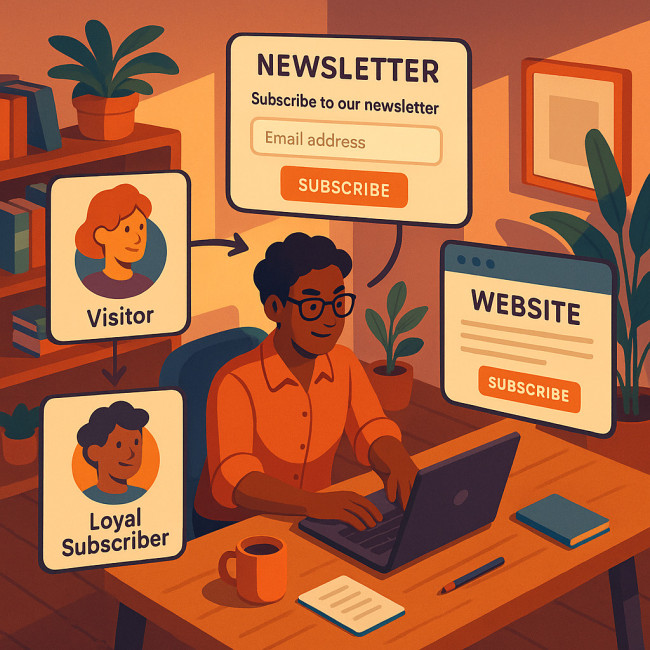
Why a newsletter signup section still outranks every social follow
Algorithms change. Email stays. A robust newsletter signup section hands you direct access to readers' inboxes—no gatekeepers, no pay-to-play. When combined with an SEO-tuned author landing page, list growth compounds discoverability and royalties alike.
Core benefits in 60 seconds
- Zero commission on sales nurtured via email.
- First-party data to tailor launches and offers.
- Higher engagement than any platform's organic reach.
- Ownership: you keep the list even if networks vanish.
The anatomy of a high-converting newsletter signup section
A converting newsletter signup section pairs punchy copy with frictionless UX. Use the following building blocks:
- Magnet headline: One sentence promising a result or emotional payoff.
- Benefit bullets: Three snack-size gains readers receive after joining.
- Minimal form: Email field plus first name only. Each extra field cuts conversion by 10–15 % (HubSpot, 2024).
- Trust cue: “Join 4 732 readers” or a short testimonial.
- Privacy reassurance: A 10-word line that you never spam.
- Compelling button copy: “Get chapter 1 now”, not “Submit”.
Copywriting hacks that make signup buttons irresistible
AIDA, but faster
Traditional Attention–Interest–Desire–Action still wins. Compress it into one headline and one button for your newsletter signup section:
- Attention: “Stuck on chapter three?”
- Desire: “Steal my 5-step writer's block fix.”
- Action: Button: “Email me the fix”.
Proven headline templates
| Template | Example for fiction authors |
|---|---|
| “Get [Result] in [Time]” | “Get a new short story every Friday” |
| “Join [Community] who [Benefit]” | “Join 5 000 mystery fans who solve early clues” |
| “Unlock [Exclusive Asset]” | “Unlock deleted scenes & alternate endings” |
Button micro-copy that converts
Replace generic verbs with reader-centric phrasing:
- “Start reading”
- “Send my bonus chapter”
- “Claim insider access”
Where to place your newsletter signup sections
Location influences perceived value. Mix multiple newsletter signup sections without overwhelming UX:
- Hero banner: Ideal for launch campaigns.
- Inline after blog post 25 % scroll: Catches readers mid-engagement.
- Exit-intent pop-up: Recovers abandoning visitors with a micro-offer.
- About page footer: Converts fans who just met you.
Source : Campaign Monitor
Psychological triggers writers can't ignore
Specificity
“Receive updates” is vague. “Receive one flash-fiction prompt every Monday” pinpoints value.
Scarcity
Offer early-bird beta-reader slots to the first 200 subscribers. Scarcity lifts urgency inside any newsletter signup section.
Social proof
Embed a single reader quote or show total subscriber count. Pair with badges from featured media to mimic the authority of media-buzz strategies.
Design cues that reinforce your copy
- Mobile-first: 60 % of signups come via phone. Use 16-point minimum input text.
- Contrast: Button color must differ from background by at least 3:1.
- Whitespace: Surround the newsletter signup section with space to avoid banner blindness.
- Load speed: Keep embedded form scripts under 50 KB. Slow pop-ups sabotage conversion.
Testing roadmap: from guesswork to data-driven wins
Follow this sprint to lift conversion of every newsletter signup section by at least 20 %:
- Create two headline variants per placement. Run each for 500 visitors.
- Swap button copy next. Hold headline constant.
- Test incentives: exclusive chapter vs. discount code.
- Review heatmaps to confirm scroll depth and visual focus zones.
Document each outcome in a simple spreadsheet or in your analytics dashboard. For higher insight, integrate new author portfolio analytics that reveal visitor journeys from bio pages to signup clicks.
Common mistakes that kill conversions
- Forcing CAPTCHA on first visit.
- Hiding the unsubscribe link in confirmation emails.
- Using stock photos irrelevant to your niche.
- Copy-pasting plugin default text—90 % of author sites do this.
Implementation checklist
Tick each item before your next book teaser drops:
- Primary newsletter signup section live in hero banner.
- Secondary inline form after 25 % article scroll.
- Exit-intent offer configured with minute delay.
- Copy follows AIDA and contains a concrete incentive.
- Button copy uses reader-focused verbs.
- Privacy promise is visible without scrolling.
- Event tracking connected to dashboards.
Quick quiz: Test your copywriting instincts
FAQ
- How many newsletter signup sections should I add to one page?
- Two to three placements—hero, inline, and footer—balance visibility and reader comfort.
- Do giveaways still work as incentives?
- Yes. Digital exclusives like unpublished scenes convert better than generic discount codes.
- What conversion rate should I aim for?
- Author sites average 1.5 %. With optimized copy and placement, 2.5 % is realistic within a quarter.
- Can I reuse the same copy across my site?
- Mirror your core promise but vary headlines to avoid banner blindness.
- Which email service integrates fastest with WordPress?
- Mailerlite and ConvertKit both offer one-click embeds and analytics hooks.
Next steps
Ready to turn browsers into superfans? Deploy your first revamped newsletter signup section today. Then refine copy weekly using the testing roadmap. For deeper engagement tactics, explore how a virtual author reading can send fresh subscribers straight to your list or learn to polish your portfolio page so every visitor flows naturally to your signup.
CTA: Want my personal checklist? Join the list through any signup on this page and receive the downloadable PDF within minutes.