Visual identity sync: match costume palettes to thumbnails that earn clicks
Your thumbnail is the first audition your profile gets. When costume colours echo or cleverly contrast with that tiny image, recruiters stop scrolling. This guide shows dancers, actors and performers how to plan wardrobe palettes that translate into irresistible thumbnails, boost click-through rates and secure more bookings.
Why costume–thumbnail harmony matters
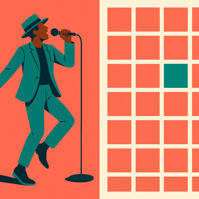
Online talent directories compress your art into a thumbnail measuring barely 200 × 200 pixels. Research from directory analytics shows that profiles with a clear, balanced palette in the hero frame receive 27 % more clicks than those with random colour mixes. When your stage costume speaks the same visual language as your thumbnail, you achieve three wins:
- Instant recognition : recruiters scanning dozens of profiles locate you faster on the grid.
- Brand consistency : your palette travels from rehearsal shots to social feeds, reinforcing memory.
- Professional cues : a curated look signals planning skills producers value on busy sets.
Three palette strategies that trigger clicks
1. Complementary contrast
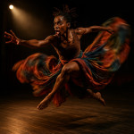
Pair opposites on the colour wheel—think teal backdrops with coral costumes. The visual tension helps soloists pop, even when directory algorithms shrink the frame. Before your next shoot, generate a quick wheel in Adobe Color or Coolors to test pairings. Keep the costume 60 % of the frame, leaving 40 % background so the contrast remains visible in small format.
2. Monochrome stories
If your act centres on mood rather than punch, a monochrome palette creates quiet sophistication. Shades of burgundy or forest green read as intentional when reduced to thumbnail size. This approach also simplifies wardrobe logistics for touring dancers juggling multiple venues.
3. Accent pop
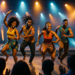
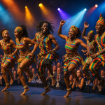
Many African dance crews wearing earth-tone garments add a single neon sash or beaded belt. The accent draws the eye without overpowering cultural authenticity. Notice how listings on the African dancers directory page showcase vibrant waist details that stay sharp in thumbnail views.
Workflow : from rehearsal to thumbnail
Colour planning should start long before the camera clicks. Follow these stages:
- Storyboarding – Plot choreography beats and assign mood colours to each section.
- Wardrobe fitting – Test garments under the exact lighting used for promo photos.
- Thumbnail framing – Shoot a tight crop preview on a phone to ensure key colours survive at 200 px.
- Post-production – Use saturation masks to lift accent tones without destroying skin reality.
- Directory upload – Title the frame with palette keywords (“turquoise-gold afro-fusion”) to strengthen SEO.
Need framing inspiration? Check the thumbnail hierarchy tips our ballet colleagues use to guide recruiter attention.
Palette selection cheat-sheet
| Palette goal | Main hues (60 %) | Accent (10 %) | Backdrop (30 %) | Best for |
|---|---|---|---|---|
| High contrast | Purple #6a2bc3 | Yellow #ffd44d | Charcoal #222222 | Solo street or hip-hop acts |
| Monochrome depth | Emerald #146b4d | Mint #9ddbc8 | Forest #0e3d2d | Contemporary troupes |
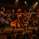
| Heritage warmth | Rust #b34729 | Indigo beads #3540a1 | Sand #d9c3a3 | Folkloric or Afro-fusion |
| Digital neon | Cyan #00e1ff | Magenta #ff005e | Black #000000 | Electronic dance collabs |
Case study : 18 % click-through lift in four weeks
Brussels-based company WaKa Afro-Moves struggled with low traffic despite flawless technique clips. After analysing their directory analytics, they discovered thumbnails looked muddy because dancers wore multi-print fabrics shot against busy murals. The team:
- Adopted the “heritage warmth” palette above.
- Reshot hero images with a plain sand backdrop.
- Added a cobalt waist sash to each costume for consistency.
Within four weeks they reported an 18 % click-through uptick and two new event bookings—proof that colour decisions convert.
For more tweaks that polish a profile beyond colour, explore profile tweaks that land shortlists.
Practical tools to lock your palette
- Palette generators : Coolors, Adobe Color, Paletton.
- Mobile previewers : Thumbor or free 200-px overlay grids.
- Swatch libraries : physical Pantone fans help ensure fabric dye matches screen tones.
- Accessibility checkers : Confirm contrast ratios meet WCAG so viewers with colour-vision differences still recognise you.
These resources complement deeper theory such as the color psychology guidelines every creative team should bookmark.
Quick self-test : are you thumbnail-ready?
FAQ
- How many costumes should share the same core palette?
- A minimum of three hero looks ensures visual consistency across gallery images without stifling variety.
- Should I change palettes for seasonal gigs?
- Yes, but rotate accent colours rather than rebuilding your entire scheme. This keeps brand recall high while feeling fresh.
- Do black-and-white thumbnails still work?
- They can, but monochrome images without a strong lighting hierarchy risk blending into directory grids. Add a bold silhouette or contrast backdrop.
- What file format preserves colour best at 200 px?
- PNG maintains sharper edges and richer hues than JPEG in small sizes, especially where neon or metallic fabrics appear.
Ready to synchronise your palette?
Plan your next costume run-through with a thumbnail preview in mind. A 30-minute colour audit can be the difference between a silent listing and a booked gig. If you need expert eyes, contact our team for a palette review that pairs artistic intent with traffic-boosting strategy.