Color psychology in dance portfolios: palettes that choreographers remember
A dance portfolio that pulses with the right hues triggers instant emotional cues in a busy choreographer's mind. This guide decodes color psychology, shows you how to build palettes choreographers remember, and delivers practical steps to refresh every page of your dance portfolio today.
The neuroscience behind palette-powered recall
Color psychology in dance portfolios is more than aesthetics. Our visual cortex processes hue before shape or text, so the palette becomes the mental shortcut a choreographer uses to remember you after back-to-back auditions. Warm pigments boost arousal, while pastel tints soothe decision fatigue. Leveraging these responses keeps your reel on the shortlist longer.
Key color triggers for performing-arts decision making
- Vibrant reds & oranges – signal energy, ideal for hip-hop or Latin styles that rely on high BPM.
- Electric blues – project precision and technical mastery, making them a clever match for ballet or contemporary solo work.
- Muted earth tones – evoke authenticity and storytelling, perfect for folkloric or site-specific choreography.
- High-contrast duos – black & gold or white & neon make thumbnails pop on crowded grids.
“When a dancer's portfolio colors echo the mood of my piece, I remember their name without checking my notes.” — Léa Vincent, resident choreographer at Théâtre du Visage.
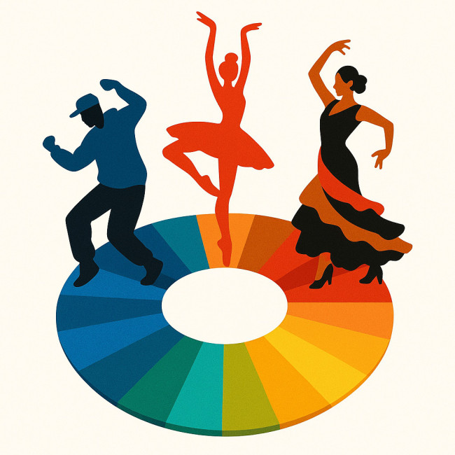
Mapping palette to dance genre
Use color psychology in dance portfolios to reinforce the genre you want to book. Aligning hues with movement style accelerates cognitive matching for recruiters.
| Dance style | Palette cue | Psychological effect |
|---|---|---|
| Contemporary | Soft greys + desaturated teal | Focuses attention on form and emotion |
| Commercial Hip-Hop | Neon lime + magenta accents | Sparks excitement and urban energy |
| Ballet | Petal pink + ivory | Conveys grace, tradition and poise |
| Afro-Fusion | Sunset orange + deep indigo | Elicits warmth and cultural depth |
| Heels | Crimson + glossy black | Signals confidence and drama |
Need inspiration for costume and thumbnail harmony? Dive into our deep-dive on matching costume palettes to thumbnails.
Audit: does your current palette help or hinder?
- Screenshot your homepage, gallery and bio page.
- Convert each screenshot to grayscale. If elements blur, you lack contrast.
- Check hue diversity: 3–5 keyed colors are memorable; more confuses.
- Run a color-blind simulator. Ensure CTA buttons stay visible.
After the audit, apply proven layout tweaks from our 2025 portfolio refresh guide.
Case study: color psychology boosts callback rate
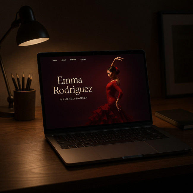
Dancer Maya Torres swapped a generic white background for a bold burgundy gradient to mirror her flamenco focus. Within one month her callback emails jumped 42 %. Recruiters said the page “felt like the show.” Color psychology in dance portfolios turns passive viewers into booking leads.
Data snapshot: palette recall rates among choreographers
Source : Pantone Color Institute
Implementing a choreographer-friendly palette in five steps
1. Define your signature emotion
Ask what sensation your dance projects sell—joy, rebellion, serenity? Choose a base hue that science links to that emotion.
2. Limit to a 60-30-10 ratio
Apply the dominant color to backgrounds (60 %), a secondary to headings (30 %) and an accent for CTAs (10 %). This keeps color psychology in dance portfolios balanced and memorable.
3. Sync portfolio photos and costumes
Ensure costumes in hero images echo your web palette. Consistency cements visual identity and avoids cognitive dissonance.
4. Add accessible contrast
WCAG 2.2 demands a 4.5:1 text-to-background ratio. Tools like Stark or Contrast Checker make compliance painless.
5. Stress-test on mobile first
Over 68 % of recruiters skim portfolios on phones. Test colors in bright daylight modes to confirm readability.
Your copy must echo the palette story too. See our guide on writing bios that blend story, skill and style.
Common pitfalls and quick fixes
- Trap: Full-bleed black-and-white gallery without an accent hue.
Fix: Add a gold CTA button and amber hover state. - Trap: Overusing gradients that clash with video thumbnails.
Fix: Reserve gradients for section dividers only. - Trap: Ignoring cultural color meanings.
Fix: Research hues before pitching international choreographers.
Quick quiz: test your palette savvy
FAQ
- How many colors should a dance portfolio use?
- Stick to three primary hues plus one neutral. This keeps cognitive load low and boosts recognition.
- Do I need to re-edit my existing videos?
- No. You can add color overlays or consistent title cards to align old clips with your new palette.
- Which file format preserves color fidelity online?
- Use sRGB-embedded JPEGs for photos and MP4 (H.264) for videos to prevent unexpected hue shifts.
- Where can I showcase my revamped portfolio?
- Publish on your site and list it on the latest dancer portfolio feed to reach active choreographers.
- Is there such a thing as palette fatigue?
- Yes. Update accent hues every 18 months to keep returning recruiters engaged.
Next steps: lock in your signature palette today
Color psychology in dance portfolios shapes the first—and lasting—impression you leave on directors. Audit your hues, apply the 60-30-10 method, and sync visuals with copy now. If you want deeper color strategy tips, read our trend report on 2025 palette choices that boost brand footfall.
Ready to stand out? Refresh your palette tonight and pitch tomorrow—choreographers will remember the dancer whose colors danced first.