Color palette refresh: align new portfolio visuals with the brands you want
Your dream clients decide in seconds whether your work looks “on brand” for them. A strategic color-palette refresh helps your portfolio send the right signals from first click to final slide-deck. Follow this step-by-step guide to audit, rebuild, and roll out hues that magnetize the brands you truly want to attract.
Why color alignment matters more than ever
Brands invest millions to own a handful of tones. If your portfolio echoes those hues, decision-makers subconsciously tag you as a natural fit. A misaligned palette, on the other hand, forces them to imagine a rebrand—or look elsewhere. Updating colors also boosts visual storytelling; see how tiny tweaks increase emotional impact in this deep-dive on portfolio storytelling. By aligning your hues with the psychological expectations of industry-specific decision makers, you remove friction from the hiring conversation: they no longer need to wonder whether your aesthetic can stretch to accommodate their guidelines because the answer is already on the screen. That subconscious certainty accelerates trust, shortens negotiation cycles, and lifts conversion metrics, turning a simple shade adjustment into measurable business value.
The psychology behind corporate hues
- Blue = Trust: Finance, tech, and healthcare prefer calm blues that signal reliability.
- Green = Growth: Sustainability-minded companies lean on earthy or neon greens.
- Red = Action: Sports, entertainment, and quick-service brands crave energy and urgency.
- Yellow = Optimism: Retail and leisure brands use warm yellows to spark joy and impulse.
Combine two or three brand-adjacent hues for nuance, but keep saturation and contrast consistent to avoid visual noise.
Audit your current palette in 15 minutes
- Open every page of your portfolio in one browser window and take screenshots.
- Drop the images into a free color extractor to list dominant hex codes.
- Group codes by hue, saturation, and brightness. Anything outside 15 % of your target palette becomes a candidate for change.
- Rate each hue against desired brand adjectives: trustworthy, playful, premium, etc.
- Remove or neutralize tones that clash with those brand goals.
Need help balancing visual speed with perfect hues? Optimise assets following the tips in our image-optimisation guide.
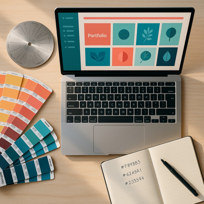
Create a strategic color library
Start with three tiers: primary, secondary, and accent. Primary colors cover 60 % of the screen, secondary 30 %, and accents 10 % for calls-to-action.
| Brand Trait | Suggested Hue | Hex Code (starting point) | Usage Tips |
|---|---|---|---|
| Premium Luxury | Deep Navy | #0d1b2a | Pair with metallic accent for buttons. |
| Sustainability | Muted Moss | #607d3b | Blend with off-white backgrounds. |
| Tech Innovation | Electric Cyan | #17bebb | Use sparingly to spotlight UI elements. |
| Playful Lifestyle | Warm Coral | #ff725e | Fade 20 % for hover states. |
Source inspiration without copying
Collect screenshots from aspirational brands, then adjust hue or saturation by 10–15 % to stay unique. For science-backed palette shifts, explore updated color-psychology data for 2025.
Apply the new palette across every touchpoint
Digital portfolio elements
- Backgrounds: Use your lightest primary or a subtle gradient.
- Thumbnail frames: Add a two-pixel border in the secondary hue to unify gallery items.
- CTA buttons: Reserve the accent color exclusively for forms and “book now” prompts.
Synchronize social thumbnails too—consistent visuals raise click-through rates by up to 24 % according to recent brand-study benchmarks.
Offline extensions
Match print collateral, stage props, or wardrobe pieces to your refreshed palette. Dancers, for instance, boost thumbnail engagement when costumes echo portfolio colors, as explained in this branding sync guide.
Test, measure, iterate
After rollout, track metrics: bounce rate, average scroll depth, and inquiry volume. Small tweaks in contrast or accent placement can lift conversions by double digits. Showcase your evolution in the new portfolio showcase on Artfolio to gather real-time feedback.
Quick self-assessment quiz
FAQ
- How often should I refresh my palette?
- Review annually or whenever your target client profile changes. Minor tweaks every six months keep your look current.
- Can I use gradients without losing brand clarity?
- Yes—limit gradients to backgrounds or hero sections and ensure both ends reside within your approved palette.
- What if a client's palette conflicts with mine?
- Create project-specific style sheets while keeping your master palette intact. This shows flexibility without brand dilution.
- Do accessibility guidelines apply to artistic portfolios?
- Absolutely. Maintain a minimum 4.5:1 contrast ratio for body text to stay inclusive and professional.
Next steps
Color choices shape first impressions. Audit your current hues today, build a focused library, and test relentlessly. When your palette resonates with ideal clients, bookings follow. Need deeper guidance? Explore advanced palette tactics inside our upcoming course and join creatives already elevating their work.