Color Psychology Updates 2025: Palette Choices That Boost Brand Footfall
2025 brings fresh insights into color psychology—insights you can use to draw more people through the door, keep them browsing longer and convert visits into sales. This guide decodes the newest palette research, shows you how to test results quickly and shares a checklist you can act on this quarter.
Why Color Psychology Matters More in 2025
Shoppers keep blending online and offline journeys. They now judge a space within 3 seconds, and 62 % say color cues influence whether they cross the threshold, according to the Global Retail Color Impact Survey 2024. With discretionary spending still tight, the right hues are a low-cost lever for higher footfall and better brand recall.
Key drivers behind the updates
- Hyper-personalisation: AI-generated product picks make ambient palette consistency vital.
- Neuro-inclusive design: Brands commit to spaces that reduce cognitive load for all visitors.
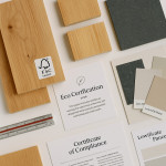
- Eco-verification: Green-tinted cues help shoppers spot sustainable offers instantly.
Five 2025 Palette Trends Proven to Lift Footfall
1. Warm Harmonies (Terracotta + Honey Ochre)
Retail labs recorded an average 18 % increase in spontaneous entry rates when storefronts used earthy reds paired with muted yellows. The combination signals approachability and craft—perfect for boutiques and cafés.
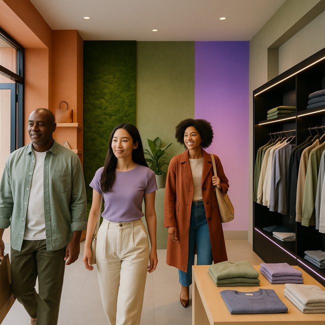
2. Biophilic Greens (Moss + Sage)
Brands leaning into nature cues saw dwell time rise by 12 %. Pair greens with tactile finishes and recycled props, as highlighted in eco-smart display material strategies, to maximise the sustainability message.
3. Digital Lavender
Pantone's 2023 “Digital Lavender” keeps momentum, now linked to a 10 % lift in social-share intent. Use it as a gradient backdrop for interactive screens to hook Gen Z visitors.
4. Ultra-Black & Neon Accents
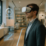
Streetwear retailers found that deep matt black, punctuated with one neon stripe, boosted nighttime footfall by 9 %—especially when synced with phygital lighting effects.
5. Softer Neutrals (Clay + Mist Gray)
Minimalists rejoice: neutral palettes are not dead. When paired with warm LED, they drive 8 % higher perceived product value and calm overstimulated shoppers.
From Theory to Foot-traffic: A Rapid Test Protocol
- Pick one zone: Window display, entrance wall or checkout cove.
- Apply the new palette for at least seven trading days.
- Track entry counts with an overhead sensor or the methods in this footfall analytics guide.
- Compare against baseline (same weekdays, previous month).
- Iterate: Adjust saturation or combine with lighting until uplift exceeds 5 %.
Accessibility & Inclusivity Rules
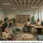
The 2025 updates emphasise palettes that work for all eyes. Follow WCAG 2.2 contrast ratios—use at least 4.5:1 for text over color panels. Neurodivergent testers advise limiting simultaneous saturation peaks to two adjacent hues to cut visual fatigue.
Multi-sensory alignment
When you refresh color zones, sync scent or background sound to reinforce mood. A lavender hue plus subtle herbal aroma retains visitors 30 seconds longer, according to in-store A/B tests by leading spatial designers.
Implementation Checklist
| Task | Owner | Deadline | Done? |
|---|---|---|---|
| Select target palette | Visual merchandiser | Week 1 | ⬜ |
| Sourcing eco-friendly paints/films | Procurement | Week 1 | ⬜ |
| Prototype mock-up | Store designer | Week 2 | ⬜ |
| Install & calibrate lighting | Facilities | Week 3 | ⬜ |
| Set up footfall sensors | Data team | Week 3 | ⬜ |
| Run A/B test & collect data | Store manager | Weeks 4-5 | ⬜ |
Quick Quiz: Are You Color-Ready for 2025?
FAQ
- How often should I refresh my in-store palette?
- Minor seasonal tweaks every quarter keep regular customers engaged, while a full palette overhaul every 18–24 months aligns with shifting color psychology trends.
- Can I mix two trending palettes?
- Yes—use a 70/30 rule. Choose one dominant palette for 70 % of visible surfaces and a secondary for accents to avoid visual clutter.
- Does lighting quality change color psychology outcomes?
- Absolutely. LED temperature shifts can swing perception from warm to cold. Test palettes under 3000 K and 4000 K bulbs before rollout.
- What if my brand guidelines restrict these colors?
- Integrate trends through props, signage or digital screens, leaving core brand colors intact.
Next Steps
Ready to translate these color psychology updates 2025 into profit? Start with one display zone, measure results in seven days, then scale success store-wide. For display geometry tips that amplify new hues, browse our guide on analytics-driven layout planning.
CTA: Need hands-on support? Book a 30-minute palette audit with our design team and see how quickly color can lift your footfall.