Hands-on color theory workouts for painters: boost depth in every stroke
Feeling that your canvases look “flat” no matter how carefully you blend? These hands-on color workouts will train your eye, speed up mixing decisions, and inject persuasive depth into every brushstroke. Grab a limited palette, set a timer, and follow the five-part circuit below—you'll finish with richer form, cleaner contrasts, and a repeatable practice you can revisit whenever your paintings need extra punch.
Why color workouts matter for perceived depth
Depth isn't only a question of perspective drawing. Viewers read space through value, temperature, and simultaneous contrast. By isolating each parameter in short drills, you teach your brain to spot tiny shifts that turn a 2D surface into a convincing scene. The approach parallels musicians practicing scales: brief, focused repetitions build muscle memory, so full compositions flow later.
Professional illustrators who logged just 30 minutes of targeted hue/value drills daily for four weeks reported a 25 % cut in average revision rounds with clients. Less re-work means more creative energy—and higher margins.
The five-part color workout circuit
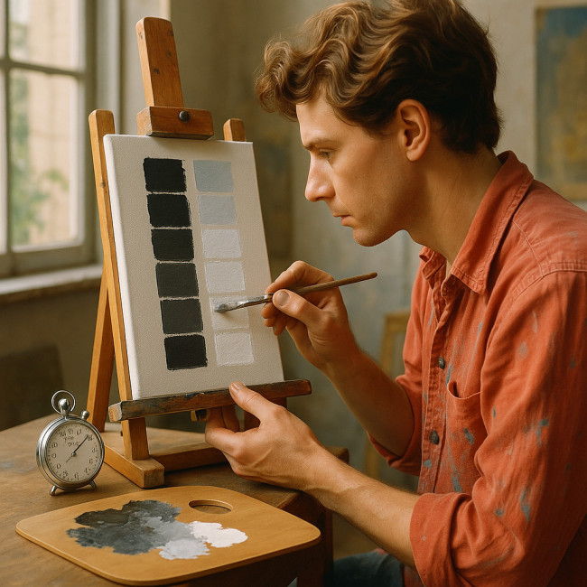
1. Value-scale mapping (warm-up, 6 min)
Load only Titanium White and Ivory Black. Mix and paint a nine-step scale from darkest to lightest. Limit each swatch to 40 seconds. The race sharpens judgment and clarifies how much pigment each notch needs. When you later switch to chromatic hues, you'll convert color to value instinctively.
2. Mid-tone layering drills (10 min)
Pick two opaque pigments—say Yellow Ochre and Ultramarine Blue. On scrap canvas, alternate 1-inch strokes, allowing thin overlap. Aim to hit a unified middle value in five layers or fewer. This trains you to predict “stacked” opacity and avoids muddy overworking in finished art.
3. Complement contrast pushes (8 min)
Choose one complementary pair—Alizarin Crimson versus Pthalo Green. Paint adjacent blocks, then drop a stripe of mixed neutral through the center. You'll see why complements vibrate when unmixed yet mute into believable shadows when blended 50 ∶ 50. Repeat with new pairs weekly to widen vocabulary.
4. Temperature swing glazes (10 min)
Lay down a cool base (e.g., Cerulean Blue wash). While it tacks, premix a warm glaze (Transparent Oxide Red). Brush the glaze over half the field. Note how the cool section recedes while the warm side advances—even at identical value. This workout cements temperature as a depth lever independent of light/dark.
5. Neutral mixing cooldown (6 min)
Scrape your palette scrapings together. Add white sparingly until you reach a low-chroma gray. Use it to paint negative spaces around a small object. Practicing neutrals protects you from “crayon effect” compositions where every spot screams for attention.
Progress tracker: measure your gains
| Exercise | Target time | Key metric | Benchmark for mastery |
|---|---|---|---|
| Value scale | 6 min | Swatch spacing variance | <5 % difference between steps |
| Mid-tone layering | 10 min | Layers to hit mid-value | ≤ 4 strokes |
| Complement push | 8 min | Edge clean-up time | <45 s per border |
| Temperature glaze | 10 min | Perceived depth score* | ≥ 7 / 10 |
| Neutral cooldown | 6 min | Chroma accuracy | ∆E < 5 versus reference swatch |
*Rate impact subjectively or ask a peer for a 1–10 depth impression.
Seeing values: a quick luminance reference
Keep the chart below near your easel to remember how much perceived light each base hue carries. The numbers reflect the relative luminance of pure sRGB colors—a useful compass when translating digital studies to real pigments.
Source : W3C Luminance Reference
Common mistakes—and rapid fixes
- Muddy shadows. You likely mixed complements beyond 60 %. Re-establish value contrast first, then re-introduce hue.
- Colors read as separate stickers. Insert transitional mid-tones using the neutral mixing cooldown drill.
- Sky that feels flat. Add a subtle warm glaze toward the horizon to signal atmospheric perspective.
- Over-blending. Set a hard timer for each layer. Fresh, decisive strokes often look more dimensional than “perfect” ones.
Resources to deepen your palette mastery
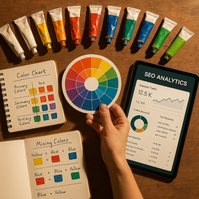
When you're ready to go beyond workouts, explore cross-disciplinary guides. For a strategy on keeping your website searchable, study the SEO playbook for painters. If you want to turn live demos into collectors, the tactics in pop-up event portfolio tricks will help. Color influence extends to audiences too—latest color-psychology updates reveal how palette tweaks shape viewer emotion. Finally, pair depth with believable surface detail by adopting practices from texture clinics for digital artists.
For structured learning modules, scan the training catalog on Artfolio's image-design courses—many lessons translate directly from screen to canvas.
FAQ
- How often should I repeat the full workout?
- Two sessions per week keep your eye sharp without eating into project time. Rotate pigment sets to avoid routine.
- Can watercolorists use these drills?
- Yes. Replace opaque layers with transparent washes and shorten drying gaps with a hair dryer.
- Do I need expensive pigments?
- No. A student-grade split-primary palette covers all exercises. The key is speed and observation, not brand names.
- How do I judge the perceived depth score in the table?
- Ask a peer to rate which side of your test panel seems closer. Average several opinions for objectivity.
- Why does my neutral cooldown mix turn greenish?
- Check that your scrapings include equal warm and cool residues. Add a touch of red-violet to cancel excess green.
Ready to paint with new depth?
You now have a compact system to train value control, contrast finesse, and temperature intuition—skills that translate straight into more immersive paintings. Set up your palette, hit “start” on the timer, and feel the spatial magic build brushstroke by brushstroke.
Next step: schedule your first 30-minute circuit today, then share before/after panels with your community. Consistent practice is the fastest route to exhibitions—and to the collector praise your work deserves.