Recruiter guide to reviewing collage portfolios: layers, textures, clarity
Speed-reading a collage portfolio is tricky: piles of overlapping images risk hiding crucial details you need for budget, timeline and brand fit. This guide breaks the evaluation into three clear lenses—layers, textures and clarity—so you can shortlist collage artists with confidence in under 15 minutes.
Why collage portfolios often confuse recruiters

Even seasoned art buyers admit that the avalanche of visual information inside a collage portfolio can feel like racing through a graphic novel with half the pages glued together. Thumbnail grids rarely reveal paper thickness, ink saturation or the true relationship between foreground and background cuts. Add inconsistent lighting across shots and you have a minefield of potential production delays, colour-matching disputes and last-minute material substitutions that explode budgets or timelines. Recruiters working on fast-moving campaigns therefore need a mental checklist that filters signal from noise in seconds, not hours, so they can justify recommendations to finance and creative leadership without scheduling an extra discovery meeting. The complexity is exciting, but without guardrails it becomes an obstacle course where brilliant talent gets overlooked simply because the story is hard to decode.
Collage art celebrates complexity. Yet that same richness can overwhelm busy hiring teams. Vague captions, inconsistent photography and missing usage details delay decisions—or, worse, push your team toward safer but less visionary options.
- Over-edited mock-ups flatten depth and misrepresent real materials.
- Minimal process notes leave production risks unexplained.
- File or shipping specs vary wildly between analog and digital pieces.
By adopting a structured review framework, you reduce those unknowns and focus on the candidate's ability to deliver your brief—not just aesthetic flair.
The 3-lens framework every recruiter should use
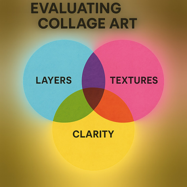
Think of the framework as a triage tool that funnels gallery-level creativity into commercial reality. First, the Layers lens spots whether an artist can build a composition that survives resizing, cropping and multipage layouts without collapsing into visual chaos. Second, the Textures lens probes how tactile choices—be they recycled newsprint, velvet flocking, or purely digital grain—scale to billboards, social posts and packaging foils without unwanted glare or pixelation. Finally, the Clarity lens forces a business check: captions, licensing statements and delivery specs must be as crisp as the art itself, because amazing imagery loses its value if rights are unclear or files arrive in the wrong colour space. When these three perspectives overlap, you see a sweet spot where imagination meets feasibility; outside that intersection lurk hidden costs, delays and legal headaches.
1. Layers: decode the artist's construction logic
Great collage portfolios showcase deliberate layering, not random stacking. Look for:
- Readable hierarchy – Focal images should guide the eye. If every element shouts, clarity may suffer on busy campaign layouts.
- Consistent scale – Wild size jumps between cut-outs can break brand guidelines once the work is adapted for packaging or web banners.
- Process snapshots – Time-lapse clips or progress stills prove the artist owns the technique, not just the final scan.
Tip: Ask candidates to map average layer counts per piece. High counts (15 +) may signal longer production and retouch cycles than your schedule allows.
2. Textures: assess tactile and digital finish
Texture determines print fidelity, shipping cost and even licensing value. During review, verify:
- Material sourcing – Archival papers, acid-free adhesives and eco inks reflect longevity and CSR alignment. See the eco-conscious material sourcing roadmap for deeper criteria.
- Lighting consistency – Portfolio photos shot under mixed lighting can mask surface sheen or matte finishes. Request a single daylight reference image.
- Digital grain control – For pure digital collages, texture overlays should retain 300 DPI resolution at print sizes. Blurry masks hint at up-scaling shortcuts.
3. Clarity: confirm narrative and licensing facts
Clarity bridges art to business. Prioritise portfolios that communicate:
- Concise project captions – Who commissioned the work? What objective did it serve? Clear captions show professional experience, not hobby status.
- Usage rights – Artists who detail past licensing deals understand your legal hurdles. Compare with this licensing guide for magazines and campaigns.
- Delivery specs – Whether TIFF layers at 600 DPI or a mounted board in a custom crate, specs save days in contract negotiations.
Still unsure? Cross-check the candidate's page on the image designers directory where verified credits, client ratings and file-prep details add an extra trust layer.
Analog vs. digital collage: quick comparison for recruiters
| Factor | Analog collage | Digital collage |
|---|---|---|
| Average turnaround (A3 size) | 7–10 days (includes drying time) | 3–5 days (export + QA) |
| Revision method | Physical overlay or re-build | Editable layers in PSD |
| Shipping/handling cost | Medium–high, depends on crate | Minimal (digital transfer) |
| Archival lifespan | 50 + years with acid-free stock | Indefinite (with backup policy) |
| Eco footprint | Paper & adhesive waste | Energy usage in render farms |
Need deeper handoff advice? Explore our analog vs digital handoffs guide.
Pre-shortlist checklist
- Portfolio displays at least three brand-aligned case studies.
- Layer hierarchy and texture shots are clearly labelled.
- Artist lists average production timeline—compare with industry benchmarks.
- Usage rights and transfer format appear in captions or downloadable spec sheet.
- Third-party testimonials or directory ratings back up quality claims.
Interactive quiz: test your new spotting skills
FAQ
- How many layers are too many for commercial print?
- Once a piece exceeds 20 distinct layers, registration errors and ink saturation can escalate print costs. Ask the artist for flatting options.
- Should I reject portfolios lacking process videos?
- No, but request high-resolution progress stills. Videos speed up trust-building yet are not mandatory if other evidence proves authorship.
- What licensing period is standard for collage in marketing campaigns?
- Most brands opt for 3-year global usage with renewal options. Confirm territories and media upfront to avoid costly extensions later.
- Is digital collage safer for tight deadlines?
- Generally yes—revision cycles are faster. However, complex 3D textures can add render time, so always request a timeline breakdown.
Action steps: move from shortlist to contract
- Share an inspiring brief template from our collage brief article to test fit.
- Schedule a 15-minute video call to review layer files or physical samples.
- Align on delivery specs and usage rights before price negotiations.
- Insert agreed data into your master creative contract; cross-reference any union or trust badges if the artist holds them, as explained in this trust badge guide.
Conclusion
Collage portfolios need not be a puzzle. Use the layers-textures-clarity framework and you'll spot production risks early, compare artists on equal footing and commission standout work without schedule shocks. Ready to build your shortlist? Browse our curated directory and reach out today.