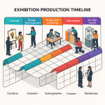
Curatorial alignment maps: collaborate smoothly with museums on exhibit stories
A curatorial alignment map is a one-page visual that synchronises your exhibit storyline, milestones and stakeholders. Use it to replace endless email chains, halve revision cycles and land museum approvals without drama.
What is a curatorial alignment map?
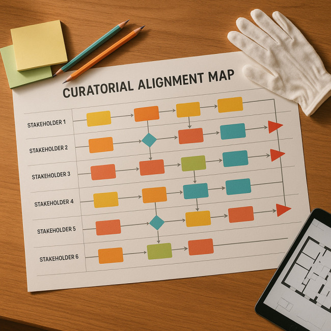
A curatorial alignment map translates the big idea of an exhibition into a sequenced flow of objectives, assets and decision-makers. It shows, at a glance, when each department steps in, how the narrative evolves and where risks sit.
- Scope strip: the three narrative pillars that cannot change.
- Stakeholder swim lanes: curators, educators, designers, marketers and conservators.
- Gate icons: sign-off deadlines mapped to calendar weeks.
- Risk flags: potential delays, courier lead times or conservation holds.
Why museums embrace alignment maps
Museum teams juggle hectic schedules and strict conservation rules. A tidy visual map slashes ambiguity and builds trust early on.
- Faster approvals. Curators know when copy, layout and mounts freeze. No last-minute changes that blow budgets.
- Clear narrative ownership. Education and marketing teams see exactly where to weave learning goals or social media hooks.
- Budget control. Finance can cross-check each step against grant requirements without combing e-mails.
- Visitor-centric design. Linking map stages to visitor-flow analytics lets you refine room order before walls go up.
Step-by-step: build your own alignment map
Think of the alignment map as an air-traffic tower for your exhibition: every incoming element—be it a courier arrival, a marketing teaser or a mount prototype—must request clearance before it can “land”. Without that tower, teams spiral into parallel email threads and out-of-sync spreadsheets that erode trust faster than a missed loan deadline. By anchoring all milestones, risks and decision-owners on one panoramic board, you spare the project countless clarification meetings and protect the story's core from scope creep. Crucially, the document is not a decorative poster; it is a living dashboard that must refresh the moment a courier date moves or a projector spec changes. That immediacy transforms a static Gantt chart into a collaborative compass, guiding every department through the complex choreography described in the next steps.
1. Gather your narrative pillars
Interview the lead curator and capture three sentences that summarise the exhibition story. These sentences become the non-negotiable spine of your map. Everything else must reinforce them.
2. Plot stakeholder touchpoints
Add horizontal lanes for each team. Insert colour-coded markers for script drafts, object lists, mount prototypes and digital interactives. This mirrors the spatial designer workflow museums already recognise.
3. Define approval gates
Use diamond icons to lock copy freeze, mount fabrication and media testing. Link each gate to a single decision-owner to avoid blurred responsibility. If you struggle to secure approvals, borrow language from crystal-clear scenography briefs.
4. Add risk flags and contingencies
Highlight import licences, lender courier dates and conservation treatments. Tie each flag to a Plan B so the map becomes a live risk register, not just a pretty graphic.
Templates & tools you can reuse
| Tool | Best for | Free tier? | Time to set up |
|---|---|---|---|
| Miro + Gantt add-on | Remote co-creation | Yes | 30 minutes |
| Figma FigJam | Design-heavy exhibits | Yes | 20 minutes |
| Google Slides timeline | Quick internal reviews | Yes | 10 minutes |
| Excel swim-lane template | Data-rich projects | Yes | 15 minutes |
| Lucidchart | Gate & risk icons | Trial | 25 minutes |
Common mistakes (and how to dodge them)
- Overloading detail. Keep the map to one page. Deep specs live in annexes.
- Skipping conservation. Always block time for object acclimatisation; use insights from eco-smart material plans to prevent last-minute substitutions.
- Forgetting digital interactives. Prototype deadlines must align with VR pre-visualisation cycles, otherwise headset testing collides with mount installs.
- Static documents. Publish the map in a cloud board and pin update dates so everyone trusts the latest version.
Mini case study: ScienceQuest Museum
ScienceQuest, a mid-size institution with 450 k visitors per year, piloted a curatorial alignment map for its “Climate Frontiers” show.
- Revision rounds dropped from six to two.
- Mount fabrication started nine days earlier.
- Sponsorship deck borrowed visuals from the map, speeding brand sign-off by 30 %.
- The museum's education team created worksheets in parallel, reducing overlapping content by 40 %.
The curator now embeds the alignment map link in every object loan request, signalling professionalism to lending institutions.
Ready to test yourself?
FAQ
- Do I need special software to create a curatorial alignment map?
- No. A timeline-enabled slide or spreadsheet works. Software just speeds icon handling.
- How often should the map be updated?
- Update after every gate meeting or when lenders confirm new conditions.
- Who owns the document?
- Assign ownership to the project manager or lead curator to avoid version chaos.
- Can the map replace formal contracts?
- It supports contracts by visualising deliverables but never replaces legal clauses.
Next steps
Download the starter template, book a 30-minute call with your museum liaison and bring your draft map to the first kick-off. Aligned stories delight audiences and keep budgets intact—your map is the fastest way there.
Want deeper guidance? Explore our guide on negotiating fair scenography fees and level up every stage of your collaboration.
CTA: Bookmark this playbook and share it with your next curatorial partner—smooth collaborations start with shared visuals.