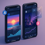
Color grading consistency: unifying diverse shoots inside one new portfolio
Struggling to make your reel feel like one cohesive story? Color grading consistency is the secret weapon that melts wildly different shoots into a seamless viewing experience. Follow this step-by-step guide to align hues, reinforce your creative signature and wow recruiters with a unified new portfolio.
Why color grading consistency boosts booking potential
First impressions stick
Recruiters judge video quality in under eight seconds. When every clip shares a coherent palette, they sense professional control and stay longer. Conversely, drastic shifts in white balance or contrast whisper “inexperience” and trigger exits.
Algorithm love
Portfolio platforms reward smooth playback metrics. Cohesive color grading reduces sudden luminance jumps that can inflate file size and sabotage loading speed. Faster pages score higher on search results and keep talent scouts engaged.
Brand alignment
Whether you shoot fashion, sports or documentaries, consistent tones help clients imagine their own branding inside your work. It signals that you can respect a predetermined style guide and deliver on-brief.
Audit your current library before re-grading
Start by mapping every asset. Create a spreadsheet noting camera model, gamma, bit depth and native white balance. This diagnosis clarifies how far each clip stands from your desired look.
| Shoot | Camera Profile | Native WB | Main Issue |
|---|---|---|---|
| Beach commercial | S-Log3 | 5600 K | Flat contrast |
| Indoor interview | C-Log2 | 4300 K | Tungsten cast |
| Night music video | RAW | 3200 K | Noise in shadows |
| Drone b-roll | D-Log | 5400 K | Green tint |
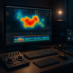
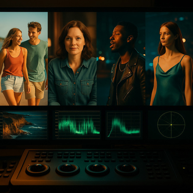
Measure objective deviation
Import a frame from each clip into a vector scope. Calculate Delta E (perceptual color difference) against your target palette. Anything above 3.0 will likely feel off to viewers.
Achieving color grading consistency step by step
Before diving into nodes and LUT stacks, visualise the destination: imagine every frame in your portfolio sitting side by side on a recruiter's wide monitor and looking as if it were captured during the same day, with identical atmospheric intent. That is the benchmark you are about to hit. To get there, you must first even out exposure, then map each camera's color science to a neutral reference and only afterwards layer your creative grade. Rushing any of these micro-steps will leave detectable seams that defeat the whole purpose of harmony. The detailed roadmap below breaks the mission into small, repeatable actions so you can replicate success on future jobs without reinventing your workflow.
- Create a reference look. Pick the shoot that already mirrors your creative intent. Use it as the hero layer in your grading software and export a still.
- Build a LUT library. Develop one base LUT for exposure and one for chroma. Keep them separate so you can tweak without destroying levels.
- Use color-managed timelines. In DaVinci Resolve, set Color Space to DaVinci Wide Gamut, gamma to Intermediate. Premiere Pro users can apply Rec.2100 HLG in the Color Workspace for headroom.
- Normalize first, stylize later. Balance white and black points on every clip. Only then add creative warmth or cooler skews.
- Batch-apply through groups. Assign matching cameras to a Group Pre-Clip node (Resolve) or Adjustment Layer (Premiere). This saves hours when updates are needed.
Batch processing workflow (DaVinci Resolve & Premiere Pro)
DaVinci Resolve
- Create Smart Bins filtered by camera metadata.
- Add Color Space Transform on Group Post-Clip to convert logs to Rec.709.
- Paste your master LUT on the Timeline node for a final uniform pass.
Premiere Pro
- Label clips by source to stay organised.
- Apply Lumetri Color basics (WB, exposure) on individual clips.
- Place a top-layer Adjustment track carrying your creative LUT at 70 % opacity for subtlety.
Integrate the graded clips inside your new portfolio
Optimise export settings
Deliver H.265 10-bit, 4:2:2, 8 Mbps for full-HD or 16 Mbps for 4K. This preserves smooth gradients created by your color grading consistency while keeping file size recruiter-friendly.
Sequence for narrative flow
Group clips by mood, not by project. Start with three visually aligned hero shots to hook visitors. Use insights from viewer heatmaps to decide order.
Add contextual captions
Brief text like “Night exterior – A6600 + Sigma 1.4 – Unified teal/orange grade” reassures technical buyers and serves latent keywords. This tactic aligns with tips in SEO-ready showreels.
Measuring success after launch
Track three metrics one month post-publish:
- Average watch time. Aim for +15 % compared with your previous reel.
- Portfolio bounce rate. A drop below 35 % shows users value cohesion.
- Direct inquiries. Color grading consistency often doubles recruiter messages because decision makers feel safer commissioning you.
Source : International Color Consortium
Common pitfalls & quick fixes
- Over-grading log footage. If skin tones look plastic, roll back saturation 10 % and add subtle film grain.
- Ignoring calibration. Grade on a monitor validated with a probe; otherwise color grading consistency collapses on client screens.
- Mismatched gamma exports. Vimeo defaults to Rec.709. Uploading HLG files there will wash out highlights. Double-check delivery settings.
- Skipping stress tests. Watch the final reel on OLED, LCD and a smartphone in daylight. If it holds, recruiters will trust your craft.
Quick self-assessment quiz
FAQ
- What is the fastest way to achieve color grading consistency on legacy footage?
- Convert everything to a common log profile with a Color Space Transform, balance exposure, then apply a single creative LUT.
- Will a LUT alone guarantee uniform results?
- No. You must first match exposure and white balance; otherwise the LUT amplifies differences instead of hiding them.
- How often should I re-grade my portfolio?
- Review every six months or after adopting a new camera. Consistency demands that new clips inherit the established palette.
- Do I need expensive hardware calibration tools?
- A sub-€200 probe is enough. Without calibration, even perfect grades will display inconsistently on client screens.
- Where can I see live examples of cohesive reels?
- Browse new videographer portfolios to study how top creators align tones across mixed projects.
Wrap-up: launch your unified reel with confidence
Color grading consistency transforms a patchwork of shoots into a magnetic story that recruiters binge-watch to the end. Audit, normalize, stylize and test—then showcase your refined reel on a lightning-fast page. Need extra polishing tips? Dive into portfolio layout strategies to pair flawless color with equally strong UX.
Ready to put theory into practice? Dedicate one afternoon to building your master LUT and watch your inquiry inbox light up.