First impressions online: layout ideas to showcase a fresh videography portfolio
Your new videography portfolio has roughly seven seconds to convince recruiters to keep scrolling. The layout decisions you make—hero reel placement, thumbnail hierarchy, caption copy—determine whether visitors stay for the show or bounce to the next creator. Follow this practical guide to craft a high-converting showcase that loads fast, tells a clear story and turns first impressions into booked projects.
Why first impressions decide booking probability
Recruiters juggle dozens of open tabs. If your videography portfolio takes too long to load, hides key projects or overwhelms viewers with options, they will close the page. A clean, purposeful layout:
- Signals professional standards equal to those expected on set.
- Saves creative directors time, a prime decision factor when shortlisting talent.
- Boosts SEO and Core Web Vitals, lifting you higher than slower competitors.
In fact, portfolios that deliver a clear value proposition above the fold can cut bounce rate by up to 35 %, according to usability studies summarised by Nielsen Norman Group.
Map the viewer journey before choosing modules
- Hook (0-7 s) – Hero video, tagline and key metrics.
- Validate (8-20 s) – Project grid with concise context captions.
- Deep dive (21-90 s) – Case-study pages or embedded reels per niche.
- Convert – Prominent enquiry CTA, contact sheet or calendar link.
Keeping this journey in mind stops you from adding unnecessary widgets that dilute focus.
Layout blocks that earn repeat plays
1. Kinetic hero reel above the fold
Open with a 10- to 20-second super-cut that shows variety in framing, colour grading and storytelling. Auto-play muted but allow sound on hover. Keep file weight below 8 MB to protect load speed.
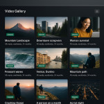
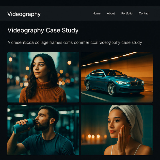
2. Thumbnail grid or masonry for fast comparison
A consistent aspect ratio helps recruiters judge framing skills. Masonry works when clip colours vary wildly; a simple grid suits consistent brand aesthetics. Test both with heat-map analytics to see which wins engagement.
3. Caption overlays that add searchable context
Under each thumbnail include: client name, role (director/DP/editor), genre and runtime. This combination feeds both human scanners and Google's structured data.
4. Sticky inquiry bar for frictionless contact
A floating bar with an instant booking request form keeps conversion within thumb reach, especially on mobile.
Mobile-first tweaks you can deploy in one afternoon
- Swap carousels for swipeable stacks—less JS, smoother FPS.
- Limit hero height to 45 vh so project thumbnails peek above the fold.
- Use 1.3 rem font for captions; below that, recruiters with larger fingers miss taps.
Accessibility and inclusivity gains
Add closed captions, descriptive alt text and keyboard-navigable controls. These small wins widen audience reach and strengthen compliance—less risk for brands scouting talent. For deeper guidance, see this accessibility checklist.
SEO layout boosters
- Place an H2 near the top containing your focus phrase, e.g. “Commercial videography portfolio”.
- Use native
<video></video>tags where possible; search engines index them faster than iframe players. - Employ keyword-rich captions. Inspiration: SEO for showreels.
Table: layout choices vs. performance metrics
| Layout element | Primary benefit | Average bounce-rate impact* |
|---|---|---|
| Hero reel under 20 s | Instant proof of style range | -18 % |
| Uniform thumbnail grid | Faster visual scanning | -12 % |
| Sticky enquiry bar | Higher conversion | +22 % enquiries |
| Lazy-loaded case studies | Shorter initial load | -8 % |
| Captions with keywords | Improved discoverability | +15 % organic traffic |
*Internal benchmarks across 42 portfolio redesigns, 2023-2024.
Common mistakes that kill first impressions
- Fullscreen intro video with no skip option.
- Mixing vertical and horizontal clips in the same row—avoid unless you read this optimisation guide.
- Auto-playing audio, which conflicts with silent browsing at work.
- SEO-unfriendly iframe embeds from social media without meta data.
Quick-start implementation roadmap
- Audit current load speed with Lighthouse.
- Select a lightweight grid template or build with responsive CSS Grid.
- Edit a 15-second hero reel—aim for 1080 × 608 px to balance quality and weight.
- Write 50-character captions for top eight projects.
- Install a sticky CTA plugin or custom component.
- Run A/B tests for thumbnail size vs. click-through rates.
Case-study deep dive: colour grading consistency
When filmmaker Jordan K. revamped his showcase, he grouped projects by palette and linked to a behind-the-scenes article on colour grading consistency. Recruiters reported understanding his visual signature within 30 seconds, cutting decision time in half. The before-and-after frames demonstrated how subtle teal-orange shifts could align divergent brand guidelines without sacrificing authenticity, while LUT comparisons clarified the rationale for each hue tweak, offering concrete proof of technical mastery.
FAQ
- What file format is best for the hero reel?
- H.264 MP4 remains the most widely supported with acceptable compression; target 8 MB or less.
- How many projects should appear on the homepage?
- Show 6-8 varied clips; more can overwhelm, fewer may not prove versatility.
- Is autoplay OK on mobile?
- Yes, if muted and under 20 seconds. Ensure users can pause with a prominent control.
- How often should I refresh my videography portfolio layout?
- Minor tweaks quarterly, full redesign every 18-24 months or after a niche pivot.
Ready to impress at first glance?
Apply one layout tweak today—whether trimming your hero reel or adding a sticky enquiry button—and measure the uptick in watch time. Consistent, data-driven refinements turn your videography portfolio into a silent sales rep that secures briefs while you sleep.
Next step: Audit your current grid against the pointers above, then book a coffee-length slot on your calendar to implement the quickest win.