Interior architect printed portfolio: choose paper stocks that enhance textures
A printed portfolio still wields unique power for interior architects. Paper stock directly influences how clients perceive your mastery of texture, scale, and light. Follow this guide to select papers that elevate material samples, drawings, and photographs—so every page feels like stepping into one of your built spaces.
Why paper choice is critical for interior architects
Clients hire you to choreograph surfaces, tactility, and spatial rhythm. Your printed book should echo that promise. A flimsy sheet or glossy coating can flatten subtle brush-rendered shadows or over-saturate colour swatches. The right stock, however, adds haptic depth, controls glare, and mirrors real-world finishes you specify on site.
- Material storytelling: Uncoated and textured stocks mimic stone, limewash, or raw timber grains showcased in your projects.
- Colour fidelity: High-grade white points keep paint schedules accurate and prevent warm tint shifts.
- Durability: Recruiters and developers flip portfolios repeatedly. A 250 gsm cover and sewn binding survive months of coffee-table browsing.
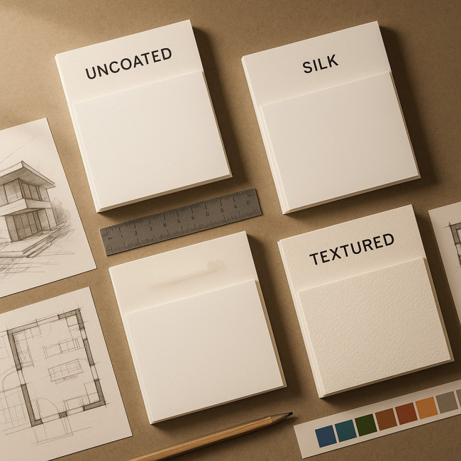
Key paper characteristics decoded
Weight (gsm)
Grams per square metre measure thickness and stiffness. Lighter pages (120–150 gsm) suit multi-page project stories, while heavier inserts (200–300 gsm) spotlight material boards or gatefold plans. Aim for a tactile cadence—think thin narrative pages interrupted by robust “sample” spreads.
Finish
The coating alters reflection:
- Uncoated: Matte, porous surface that feels like porous plaster. Ideal for pencil sketches and muted palettes.
- Silk: Subtle sheen, balancing colour vibrancy with minimal glare—great for daylight visualisations.
- Gloss: High reflection; only use sparingly on hero photos where mirror-like surfaces (e.g., polished terrazzo) are part of the concept.
Texture (Calendering & emboss)
Manufacturers press patterns into the sheet. A linen or felt mark instantly hints at upholstery fabrics or acoustic wall panels you specify. Embossed stocks also create micro-shadows that add depth to monochrome line drawings.
Opacity
Below 90 % opacity, dark images ghost onto the next page. For double-sided mood boards choose ≥ 95 % to avoid visual “bleed” that distracts decision-makers.
Comparative guide to popular stocks
| Paper family | Weight tested | Finish | Best portfolio use | Pros | Watch-outs |
|---|---|---|---|---|---|
| Mohawk Superfine | 148 gsm | Uncoated | Process sketches & neutral palettes | Cotton content feels luxurious | Natural white may warm cool greys |
| Fedrigoni Sirio Pearl | 210 gsm | Pearlescent | Metallic fixture photography | Subtle shimmer echoes brass trim | Can overpower matte-finish shots |
| GF Smith Colorplan | 270 gsm | Textured | Section dividers | 40+ colours for coding project types | Requires heavier binding thread |
| Munken Kristall | 170 gsm | Smooth uncoated | Full-bleed renders | High whiteness keeps paint swatches true | Fingerprints show on dark images |
| Antalis Keaykolour | 120 gsm | Natural texture | Narrative text pages | Recycled fibres support eco message | Lower opacity on duplex prints |
Step-by-step selection workflow
- Audit content: List spreads that need colour accuracy, texture emphasis, or fold-outs.
- Order swatch books: Mark sheet references directly on project boards for quick comparison.
- Test print critical pages: Run a single-page proof on at least two candidate stocks to judge saturation and tactile feel.
- Sequence for rhythm: Alternate light and heavy stocks so the reader senses progression—light pages for storyline, thick inserts for material focus.
- Specify binding early: Tell your printer about mixed weights; PUR perfect binding or section sewing prevents cracked spines.
Sustainability considerations that impress modern clients
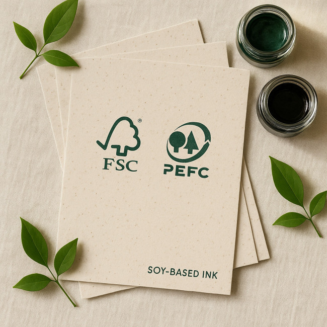
Eco-conscious developers now demand low-impact collateral. Selecting FSC-certified or recycled sheets aligns with their values and strengthens your pitch. Highlight the certification stamp on your imprint page and reference sustainable choices in project case studies.
- Recycled fibres: Stocks like Keaykolour Recycled reduce virgin pulp use by up to 60 %.
- Carbon-balanced papers: Some mills offset manufacturing CO₂ through verified forestry projects.
- Vegetable inks: Soy-based inks bond well to uncoated sheets and support rich blacks without petroleum solvents.
For deeper guidance on eco-specifications inside built spaces, review our piece on specifying sustainable finishes interior clients love.
Print layout tricks that showcase tactile depth
Use gatefolds for oversized elevations
A fold-out page printed on 200 gsm lets readers trace circulation paths without removing drawings from the book.
Spot-varnish material swatches
Adding clear varnish over timber grain photos creates contrast against the matte stock. It demonstrates how light interacts with the actual finish.
Die-cut windows reveal layers
Cut-outs framed by thicker divider pages let viewers peel through façade layers—a playful nod to section details.
Real-world timeline and budgeting
Expect 3–4 weeks from pre-press to delivery for a 40-page mixed-stock portfolio. Below is a typical cost breakdown for 50 copies in A4 landscape:
| Item | Unit cost | Qty | Total |
|---|---|---|---|
| Printing (4-colour) | €18.00 | 50 | €900 |
| Mixed paper upcharges | €2.50 | 50 | €125 |
| Section sewing & linen cover | €6.00 | 50 | €300 |
| Proof runs (2 stocks × 3 pages) | €15.00 | 1 | €15 |
| Contingency (10 %) | €134 | ||
| Total estimate | €1 474 |
Need to defend costs to decision-makers? Pair your printed book with a lightweight digital version—our article on compressing 3D files for a digital portfolio covers file prep without sacrificing quality.
Common mistakes to avoid
- Uniform stock throughout: Monotony dulls tactile storytelling.
- High-gloss photos next to text: The glare distracts from narrative paragraphs.
- Ignoring grain direction: Cross-grain folds risk cracking heavyweight dividers.
Integrating print with online discoverability
Your printed piece often lands after a recruiter has scanned your online presence on platforms like curated spatial designer portfolios. Maintain visual continuity: mirror type styles, reuse colour codes, and cross-reference page numbers with clickable case-study anchors online.
For metadata tweaks that bridge print and search, read our SEO guide for architect portfolios.
Quick self-assessment checklist
- Does every project start on a right-hand page with at least 120 gsm weight?
- Have you included a tactile interruption (texture, die-cut, or varnish) every 6–8 pages?
- Are project colours consistent between digital renders and printed proofs?
- Is the paper certified (FSC, PEFC) and noted in the colophon?
- Does the binding open flat to allow panoramic room shots?
Mini-quizz: Paper savvy test
FAQ
- Can I mix recycled and virgin fibres in the same book?
- Yes. Printers simply allocate separate signatures for each stock. Keep colour-critical pages on the brighter sheet to avoid tonal mismatch.
- Is digital print quality on textured stock reliable?
- Modern HP Indigo and dry-toner presses hold fine lines on lightly textured sheets. Deep emboss patterns, however, may break ink coverage.
- How many copies should I print?
- Most freelancers order 30–60 copies: 10 for hot leads, 20 for events, and a buffer for unexpected juries or awards.
- Does heavier paper increase shipping costs significantly?
- Switching from 130 gsm to 170 gsm across 40 pages adds roughly 180 g per book—well below most courier bracket jumps. Weight spikes occur mainly from thick covers and inserts.
- Should I laminate the cover?
- Silk-touch or soft-feel lamination protects against scuffs while retaining a sophisticated matte appearance. Avoid gloss laminate; it clashes with the muted elegance interior architecture showcases.
Take your next step
Curating materials is your craft—let your portfolio prove it. Gather swatches, run proofs, and build a tactile narrative that speaks before you do. When you are ready to refine project storytelling, dive into our article on visual storytelling tweaks for unforgettable portfolios, then put these paper insights into practice.
Ready to print? Compile your favourite stocks, brief your printer, and watch each page echo the textures that define your spaces.