Exhibition scenographer portfolio mood boards: tell immersive narratives
Recruiters scroll fast. A single glance at your portfolio mood boards must reveal how you weave light, material and visitor flow into unforgettable spatial stories. This guide shows you step by step how to curate, structure and annotate your boards so museums, agencies and brand teams instantly grasp your narrative power—and book you.
Why mood boards decide 70 % of exhibition scenography shortlists
Attention spans online rarely exceed a few seconds, yet those fleeting moments are decisive for your career. A well-orchestrated mood board acts like a visual hook: a headline hero image anchors the eye, material swatches whisper tactility, swathes of colour promise atmosphere, and directional arrows foreshadow the visitor's emotional journey. By embedding this whole dramaturgy on a single canvas, you transform a static page into a mini-experience that communicates scope, feasibility and audience impact simultaneously—compelling even the busiest curator to pause, lean in and imagine walking through your future exhibition.
Hiring managers often lack the time to study plans or technical drawings on a first pass. Their eyes hunt for three signals:
- The overarching story arc – Does every visual cue reinforce the exhibition's theme?
- Material realism – Can they picture budgets and buildability at a glance?
- Visitor emotion – Do photos, textures and colour palettes hint at how guests will feel?
Well-crafted mood boards place those signals on one tidy canvas. If you skip this stage, you force curators to guess—most will move on to a designer whose narrative is crystal clear.
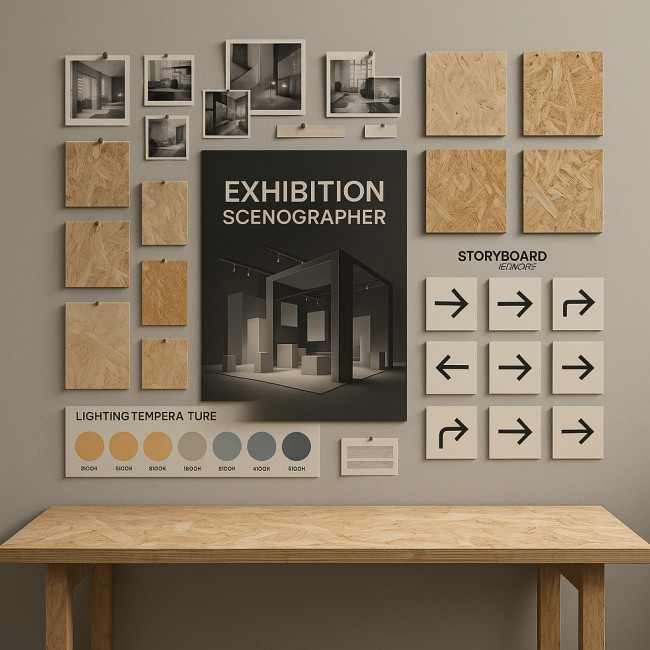
Assemble assets that spotlight your storytelling range
1. Collect scene-setting hero images
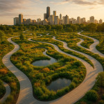
Lead with two or three high-impact visuals that summarise the exhibition concept. For instance, an aerial render showing how visitors circulate through zones communicates both aesthetics and flow.
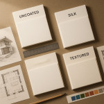
2. Layer supporting textures and materials
Include close-ups of fabrics, recycled plywood samples or interactive screens. Recruiters assessing eco-credentials will appreciate proof that you know the difference between novel and low-impact materials.
3. Add lighting cues
Use gradient swatches or night-mode photos to indicate how colour temperatures shift. A concise note such as “2700 K warm pools for artifacts / 5600 K top light for circulation” shows you master both mood and conservation rules.
4. Plot visitor journey frames
Small storyboard panels or arrows help curators imagine timing and anticipation. For deeper data-driven evidence, link to a case study where you used visitor-flow analytics.
Curate with a clear hierarchy
Eye-tracking studies reveal that viewers scan left to right then diagonally downward. Arrange your board so the narrative unfolds in that pattern:
- Top left: hero image
- Top right: headline colour palette
- Centre: material swatches and lighting diagrams
- Bottom band: storyboard panels with concise captions
Embed micro-copy that sells your thought process
Mood boards fail when they rely on visuals alone. Add eight-to-twelve-word captions that answer “why” for each asset. Example: “Recycled aluminium cladding echoes archive vault theme while halving weight.”
Best tools for high-fidelity mood boards
| Tool | Strength | Weakness | When to choose |
|---|---|---|---|
| Figma | Real-time comments by curators | Large files can lag | Remote approvals |
| Milanote | Drag-and-drop ease | Limited export control | Early concept dumps |
| InDesign | Print precision | Steeper learning curve | Physical pitch meetings |
| Twinmotion | Immersive 360° previews | GPU heavy | Showcasing VR pre-visualisations |
Annotate for accessibility and inclusion
Alt-text on every image and colour-contrast checks aren't optional. They prove you design for all audiences and align with inclusive scenography guidelines. Bonus: search engines reward descriptive alt attributes, boosting portfolio SEO.
Sequence boards into a persuasive portfolio flow
A hiring manager should complete your entire portfolio in under four minutes. Aim for this rhythm:
- Project hero slide – one board, one tagline.
- Process slide – brief caption on client goals.
- Mood board – the star of the show.
- Outcome slide – final build photo + metric (e.g., “32 % dwell-time increase”).
Repeat the sequence no more than five times to avoid fatigue.
Case study: converting a museum brief in 48 hours

Speed often trumps perfection in competitive tenders. By distilling your entire concept into one annotated panel, you equip stakeholders to champion the idea internally without you in the room. They can forward the board by email, print it for trustees, or reference it during budget debates, all while retaining your original intent. That portability turns your mood board into a silent salesperson that keeps persuading long after the initial pitch, accelerating approvals and compressing the gap between concept and contract.
Recently, a curator contacted me via the new spatial-designer listings on Artfolio. By sending one sharply annotated mood board, I highlighted a sustainable material swap that cut their production budget by 18 %. They booked a discovery call within two hours and approved the concept without requesting PDFs.
Common pitfalls to avoid
- Overcrowding: More than 15 assets dilutes focus.
- Mixed colour spaces: Ensure RGB/CMYK consistency or printed pitches will shift.
- Generic stock images: Recruiters know Unsplash—show original sketches or renders instead.
- No call-to-action: End every board with contact info or QR link for next steps.
Interactive check: are your boards recruiter-ready?
FAQ
- How many mood boards should one project include?
- One polished board generally suffices. Add a second only if you must show contrasting concepts.
- What resolution keeps images crisp without slowing load time?
- Use 1600 px on the longest side at 72 dpi. Compress with modern codecs like WebP for 40 % smaller files.
- Is video ever appropriate on a mood board?
- Short five-second loops of light transitions or kinetic elements can elevate understanding—embed with autoplay muted.
- How do I protect intellectual property when publishing boards online?
- Add a discreet watermark and share only low-risk angles. For confidential briefs, supply boards after signing NDAs.
Next step: turn clarity into contracts
Your portfolio mood boards are now recruiter-ready. Package them into a tailored deck, then send alongside a bulletproof brief—learn how in our guide on writing crystal-clear scenography briefs. Every clear image and caption brings you closer to the next immersive commission.
Ready to upgrade your portfolio? Refine one project today and track how many more callbacks you receive this month.