 Directory
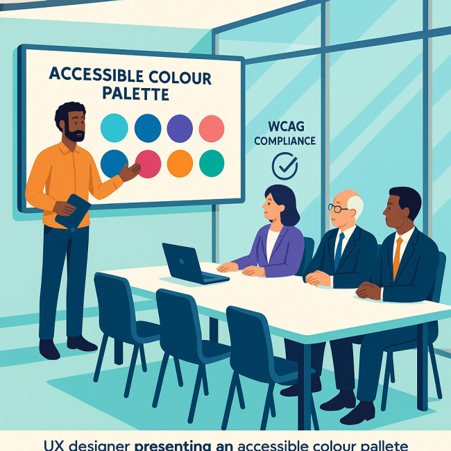
Webdesigner accessible palettes: WCAG checks that secure bigger brand briefs
Accessible palettes are no longer a “nice to have.” They are a deal-maker when enterprises shortlist web-design partners. In this guide, you will learn why colour accessibility matters, the WCAG ratios that govern success, a streamlined audit workflow, and persuasion tactics that help you land high-value brand briefs.
Why accessible palettes win enterprise briefs
From disability-rights press coverage to million-follower TikTok reviews that shame hard-to-read websites, the conversation around colour inclusion has crossed into the mainstream. Enterprises panic when influencers highlight inaccessible branding, because a single viral post can erode trust faster than any formal lawsuit. By walking into the pitch with a rigorously tested palette—complete with ratio scores, simulation screenshots, and audit logs—you position yourself as the partner who neutralises reputational risk before it starts. That readiness immediately short-circuits procurement objections about overhead, timeline, or governance reviews. In short, accessible palettes no longer reflect ethical flair; they are tactical assets that protect quarterly revenue, satisfy ESG dashboards, and unlock global market segments that legacy competitors still overlook.
Global companies worry about lawsuits, CSR pledges, and user-base expansion. An accessible palette tackles all three. By proving that your colours meet WCAG contrast thresholds, you:
- Lower legal risk for the client's digital estate.
- Demonstrate inclusive brand values that resonate with Gen Z and diverse markets.
- Widen conversion funnels—users with low vision represent roughly 2.2 billion people worldwide.
Those benefits echo the success stories featured in fast-loading portfolio revamps and story-driven showcases, where accessibility is a top filter for corporate recruiters.
WCAG colour contrast essentials
Most designers memorise the famous “4.5 on 1” ratio and stop there, yet executives will quiz you on the nuances that separate advisory guidelines from the legal minimum. WCAG 2.2 introduces additional success criteria, and regional standards like EN 301 549 or Section 508 echo those numbers almost verbatim. That means your palette has to travel well across continents and regulatory frameworks. To streamline reviews, translate every HEX value into a single line item that lists contrast against white, black, and the primary brand background. This granular mapping forms the evidence dossier that legal teams expect before they sign off on a global rollout. Remember: ratios are the easy part; the proof-of-due-diligence paperwork is the real currency when Fortune-level clients sit at the table.
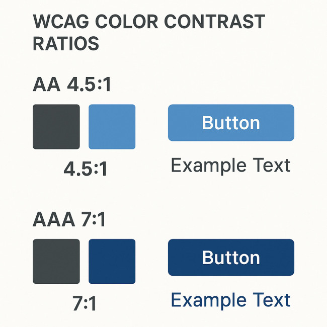
Key ratios to remember
- AA normal text – 4.5:1
- AA large text – 3:1 (text ≥ 24 px regular or 19 px bold)
- AAA normal text – 7:1 (recommended for high-risk sectors)
- AAA large text – 4.5:1
- Graphical objects/UI components – 3:1
These ratios form the backbone of every accessible palette. Keep them in a cheat-sheet near your design boards.
Fast contrast audit workflow
Time is money when pitching. Follow this five-minute routine to test a draft palette:
- Drop swatches into a contrast checker such as Stark, Colour Contrast Analyser, or Figma's built-in tool.
- Create a matrix of foreground–background pairs.
- Validate each pair against the target WCAG level.
- Label fails in red, passes in green.
- Iterate hue, luminosity, or weight until all pairs pass.
Need inspiration on accessible text patterns? Explore screen-reader friendly case studies that blend typography and compliant colours.
Building an accessible palette step-by-step
- Audit the existing brand colours. Identify any heritage shades that must stay. Calculate contrast gaps.
- Create tonal ramps. Derive light, medium, and dark variants of each hue to unlock compliant pairings.
- Assign functional roles. Map colours to components—primary buttons, alerts, backgrounds—so contrast is baked into the design system.
- Stress-test on real content. Prototype pages in Figma or CodePen and run a full WCAG scan.
- Document tokens. Publish HEX, RGBa, and HSLa values plus contrast scores. Enterprise teams love a thorough spec.
When you publish the final palette, link it to a public style guide—exactly the clarity that helped designers on brand-footfall colour psychology projects.
Tools that simplify WCAG verification
| Tool | Key feature | Price tier | Ideal project size |
|---|---|---|---|
| Stark | Live contrast checker inside Figma, XD, Sketch | Free & Pro | Freelance to enterprise |
| Colour Contrast Analyser | Desktop app with simulation of colour-vision deficiencies | Free | Audits & QA |
| Tota11y | Bookmarklet overlay for quick page scans | Free | Prototype reviews |
| axe DevTools | Browser extension with WCAG reports | Free & Enterprise | Legacy site remediation |
| Contrast Grid | Generates pass/fail matrix for multiple swatches | Free | Palette design phase |
Pair at least two tools: one inside your design app and another inside the browser. Redundant checks reassure risk-averse stakeholders.
Pitching accessibility to decision-makers
Even the most ethical brand still needs a business case. Use these talking points:
- Market reach: WCAG-compliant colours unlock up to 15 % of extra users.
- SEO boost: Accessible sites often achieve lower bounce rates, a positive signal for Google Core Web Vitals.
- Cost avoidance: The average accessibility lawsuit in the US costs $27k plus remediation fees.
- CSR alignment: Inclusive UX supports Environmental, Social & Governance (ESG) reporting.
Reference the image-design success stories listed on Artfolio's premier designer roster to show prospects that accessible palettes already win awards.
Common pitfalls and how to avoid them
- Ignoring hover states: Make sure colour changes on interaction still meet contrast ratios.
- Accessory text on images: Overlay captions need at least 4.5:1 against the photo's average luminance.
- Low-opacity layer patterns: Semi-transparent overlays shift luminosity; retest after applying effects.
- Lack of documentation: Enterprise dev teams will approximate colours if no design token library exists.
FAQ
- What WCAG level do large brands usually request?
- Most Fortune 500 briefs mandate at least WCAG 2.1 AA, with AAA reserved for healthcare, finance, and government portals.
- Is black on white always compliant?
- Yes, the contrast ratio is roughly 21:1, well above AAA. However, pure black can strain users with dyslexia. Consider dark charcoal.
- Do brand accent colours need to pass every ratio?
- No. Decorative elements can fall below thresholds if they convey no essential information. Text and actionable components must pass.
- How often should I audit an accessible palette?
- Run a contrast audit every time you add a new component, adjust colour tokens, or update brand guidelines.
- Can gradients be accessible?
- Yes, if the start and end colours maintain sufficient contrast with any overlaid text. Test multiple sample points.
Quick quiz: test your palette savvy
Next steps
You now have the roadmap to craft accessible palettes, verify them with WCAG checks, and pitch their value. Ready to turn theory into profit? Download the free contrast-audit worksheet and start optimising your next mock-up today.


